“The creation of something new is not accomplished by the intellect but by the play instinct . . . ”
Carl Jung
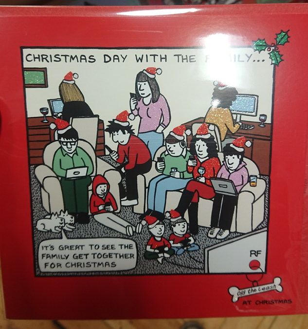
It is important to approach design with play and experimentation to come up with creative solutions. Play allows you to try anything and everything to spark ideas which could potentially be useful. These are a few examples of playful activities that could be helpful for generating ideas.
Make marks in time to music – it doesn’t matter what the outcome looks like! Just make a response to the music in any medium and see what you end up with.
Build using building blocks
Make something with modelling clay or blu tack
Draw 10 circles, set a timer for 1 min then try and draw as many things as you can using the circles.
Find any object then spend 1 min thinking of as many possible uses for the object as you can.
Pick a word then spend 1 minute writing down as many words as you could possibly associate with it.
Try applying a personality to an inanimate object. What would it talk like? How would it behave?
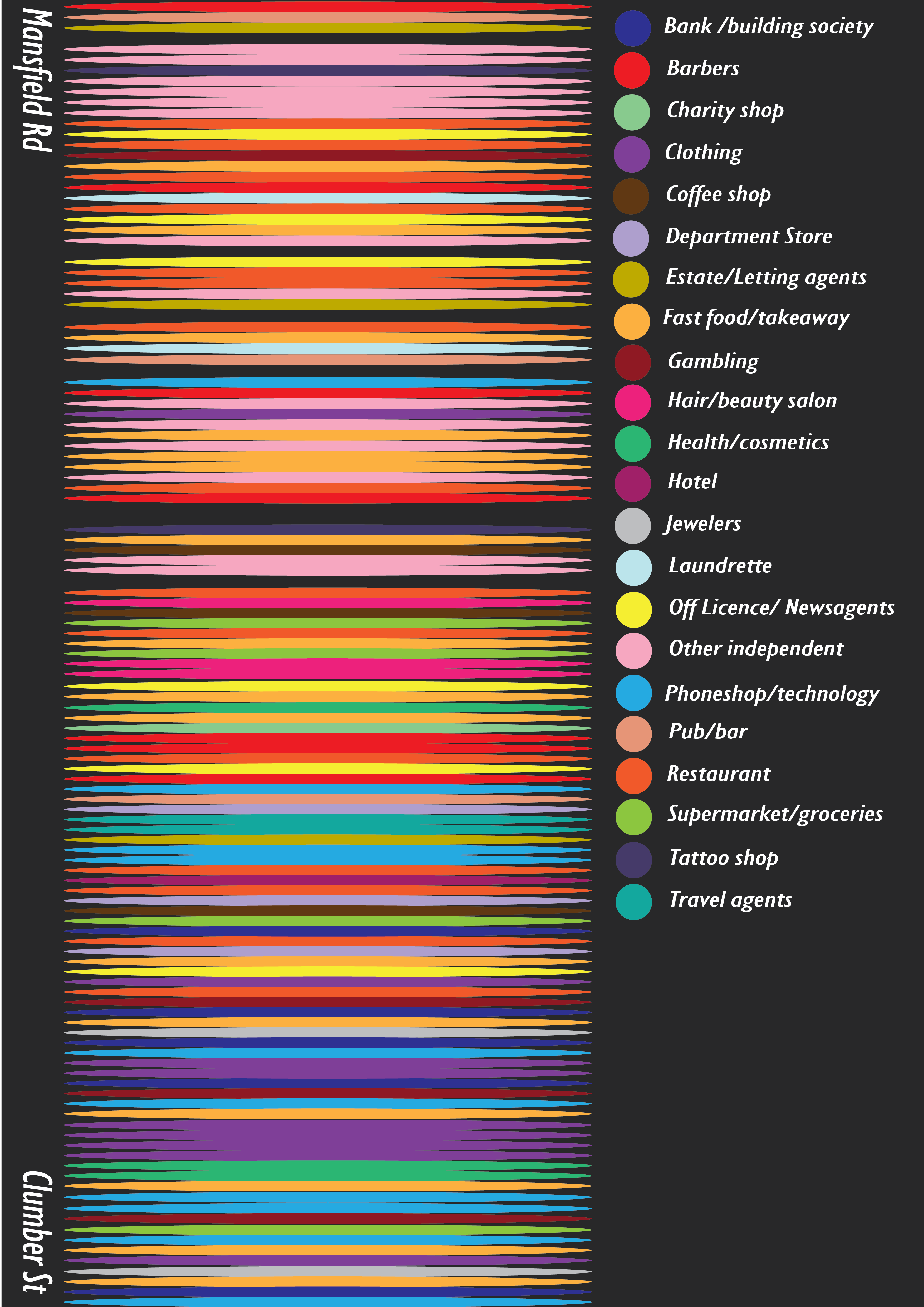
This exercise involved taking photographs of shop fronts from the top of Mansfield Road, at the edge of the city, to Clumber Street in the city centre. It was interesting to observe the types of businesses that became more or less common towards the city centre. In total I took over 100 photographs and produced this infographic to display the variation in types of business. The gaps between colours represent businesses that have closed down.
I am now going to analyse the signage used on some of these businesses to see the differences between smaller, more independent businesses at the top end and the more commercial brand names at the bottom. I will select a few examples from the top, middle and bottom of the road to give an idea of the contrast.
Mansfield Road (top)
At the top of the road there are many more small independent businesses such as the record shop ‘Anarchy Records’. Like many of the shops in this area, it’s signage is not particularly ‘professional’ looking. The signage doesn’t even spell out a clear name for the shop however this isn’t necessarily needed as it isn’t a business that needs a clear brand name. It only requires local recognition and the bright hand painted signage is certainly bold enough to attract the right market. It stands out amongst the saturation of other shops because of it’s unique style.
Another shop in the area that exhibits it’s own unique style using hand painted signage is ‘Spit & Sawdust’. I consider both of these examples to be evidence of where ‘unprofessional’ signage doesn’t necessarily mean it is poorly designed or unattractive.
This slideshow requires JavaScript.
Other businesses in this area show examples of what would be considered poorly designed signage including things like off licences, takeaways and barbers. A lot of this signage is very dated or has clearly been a quick fix for a small business that may not need/have the funds for professional branding. The images shown are some typical examples.
Mansfield Road (middle)
This slideshow requires JavaScript.
To start with, we begin to see small businesses using cleaner, more professional signage juxtaposing the unprofessional signage that is more common at the top of the road. The string of small businesses with unprofessional signage eventually gives way completely to well known brands which have more corporate identities and look much more upmarket.
This slideshow requires JavaScript.
Clumber Street
This slideshow requires JavaScript.
The trend of professional signage and established brands continues on Clumber Street. There are now practically no independent businesses. Everywhere you look there is a recognisable logo and a professionally designed shop signage to go with it.
The word ‘urban’, for me, conjures up images of city skylines, contemporary styles, graffiti, fashion, busy lifestyles and fusions of all sorts of culture. Each city of course, has it’s own aesthetics and styles associated with it but most are filled with brands that can be considered to be ‘urban’.
Examples of urban branding:
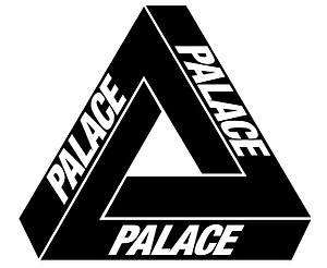
Palace – London based skateboarding/streetwear brand
Skate culture
Street art
Bold
Geometric
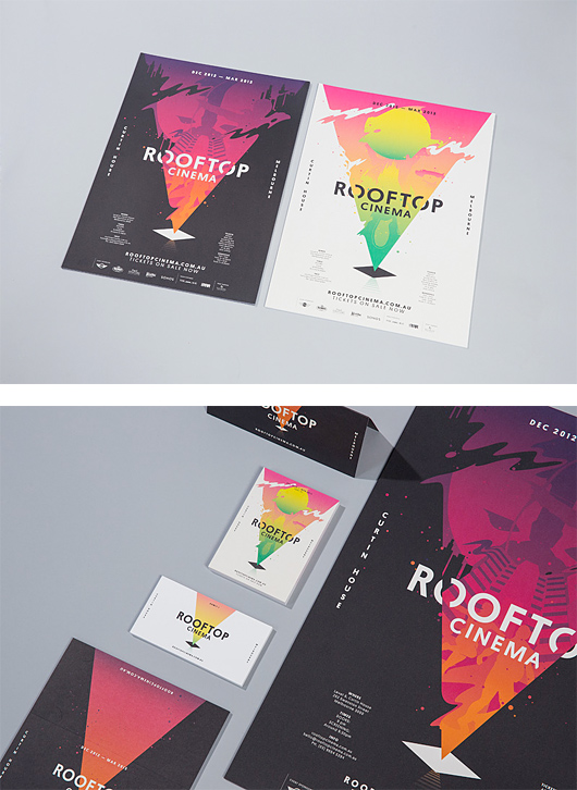
Rooftop Cinema Branding by SouthSouthWest – Melbourne, Australia
Sunset coloured gradients
Geometric shapes
silhouettes
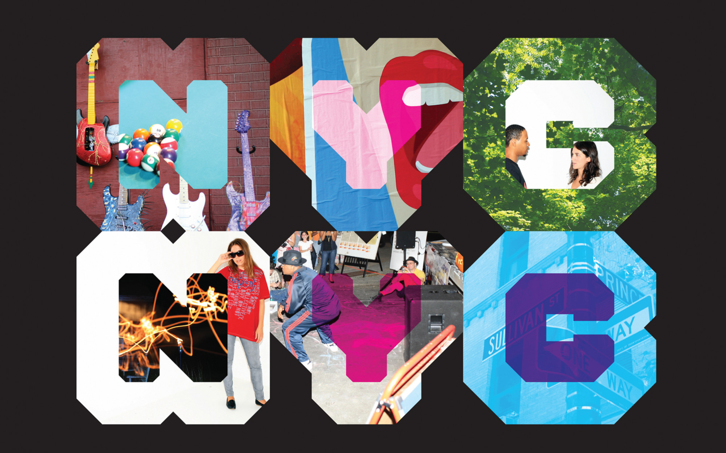
NYC branding – Wolff Olins
Geometric
Photography
Bright Colour
Baby Branding
Branding for babies needs to target parents in a way that makes them feel the product is appropriate for their child. It needs to be a balance of styles that convey that the product is child friendly while also looking professional and high quality.
The First Things First manifesto was published in 1964. It was written by British graphic designer Ken Garland with support from over 400 graphic designers, photographers and students. It also received support from the Labour MP Tony Benn who had it published in The Guardian newspaper to ensure it’s ethos was made accessible enough to spread awareness.
The objective of the manifesto was to ensure that in an increasingly consumerist culture, the purpose of graphic design would not become simply a commercial tool used for sale and promotion of goods and services. This is not to say that graphic design would be removed from that purpose, rather that a humanist approach to graphic design was considered a priority. It called for the skills of designers to be used for the greater good of humanity and appreciated as such.
in 1999 the non profit, pro environment activist magazine, Adbusters, published an updated version of the manifesto. It was titled, First Things First 2000. [Read here]
It was signed by 33 well respected members of the international graphic design community in an attempt to reopen the debate of the values of graphic design in an era where consumerism had continued to shape the world we live in. The message of the original manifesto seemed to have been neglected in favour of the way society rewarded a consumerist approach to graphic design.
This is still an issue that impacts the way designers choose to value their skills. In a consumerist culture, it becomes difficult to prioritise a humanist approach when there is little incentive offered to the individual. Arguably, this makes the message of the First Things First manifesto more relevant than ever to prevent graphic design from being misused purely for the benefit of financial gain. It is important that a balance is struck between graphic design for commercial use and for the good of humanity.
My Manifesto
I oppose the unethical exploitation of people, animals and the unsustainable ways which the Earth’s resources are being abused. This means that wherever possible, I will avoid endorsing any company, person or product that is promoted at the expense of others or the planet. This includes anything tested on animals, containing animal products, anything that is exploitative of the workforce, anything that I consider to be discriminatory, and anything that causes substantial environmental damage.
Instead, I would prefer to focus my creative energies on areas that promote a more positive world to live in.
I accept that this may not always be possible due to the current political and social climate of the world we live in, however I will aim to make my best effort to minimise any suffering to others and the planet.
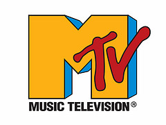
There are clear relationships in the 1980s inspired aesthetic Kavinsky uses both sonically and visually. An example is the way the type used for his logo is very similar to the typography used on the original MTV logo, which launched in August 1981 and came to define a shift in pop culture to an age where the music video rose to prominence.
This ’80s aesthetic’ can be defined as postmodern. The version we see today has been heavily influenced by leading radical designers of the era, The Memphis Group. This is where we see the use of bright colour and bold patterns that came to influence graphic design of the time.
The title of the album itself is a nod to the 1986 Sega arcade game of the same name.
Kavinsky’s album artwork and music videos even feature the same Ferrari Testarossa Spider as the one featured in the original game. This enhances the 1980s nostalgia fed by the synth heavy music.
In fact, Kavinsky has even released his own video game which heavily features the hallmarks of a retro 80s style. From it’s triangular shapes and Memphis influenced graphics, to the neon signs plastered all over the virtual city.
Jason Galea’s Art Directon For King Gizzard & The Lizard Wizard
This slideshow requires JavaScript.
Jason Galea’s artwork for Australian psych rock band King Gizzard & The Lizard Wizard clearly draws influence from the original psychedelic artwork of the 60s. Despite being a more contemporary incarnation of the genre, Galea Captures a similar aesthetic to reflect the overall feel of the music.
Obvious comparisons can be made to these classic psych album covers in terms of the choice of bright colours, art style, layout and typography used.
This slideshow requires JavaScript.
Galea also works on producing music videos for the band including this animation for ‘The River’.
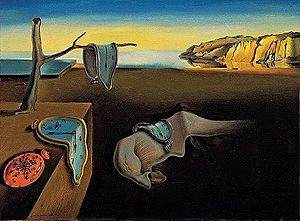
The psychedelic animation style and the inclusion of the yellow aeroplane at the end of the video made me wonder if this was a nod to The Beatles Yellow Submarine animation.
Comparisons could also be drawn to the ‘Pink Elephants on Parade’ scene in Disney’s 1941 movie, Dumbo.
This scene is said to be heavily influenced by surrealist artthat was at it’s peak in the couple of decades prior to the films release. This relationship can also be seen throughout the Yellow Submarine animation. There is a particularly obvious nod to Salvador Dali’s The Persistence of Memory.