“A logo derives meaning from the quality of the thing it symbolizes, not the other way around.”
Paul Rand
A logo’s purpose is to be the face of a company. A logo needs to work at both small and large sizes to be fit for whatever purpose the brand may need it for. A logo must have enough longevity to maintain its link to the brand.
Wordmarks
Wordmarks are logos that are typographic. One of the most famous examples of a wordmark logo is Lindon Leader’s logo for FedEx.

Despite being purely typographic, Leader’s arrangement of the letters ‘E’ and ‘X’ create an arrow symbol out of the negative space. In an interview with Creative Bloq, Leader describes the key things the client wanted the identity to communicate as, “precision, service, speed, reliability.” This was achieved through the clean sans serif typeface used to create subliminal messaging in the form of the arrow symbol. The result is a timeless and effective brand identity which still looks up to date over 20 years after it was designed.
Pictoral Logos
Pictoral logos identify the brand using a picture. This can include visual depictions of the brand name or can depict the overall purpose or message of the brand.
One example of a brand’s name being depicted through a logo is the Apple logo. Throughout years of carving out such a globally recocnised brand identity, the apple logo is easily identified without giving away any visual cues to what the brand produces and no need for type to clarify their name.
The logo that is so recognised today first took shape in 1977 when Rob Janoff was approached by Steve Jobs while the company was less than a year old. Janoff was tasked with developing an identity to coincide with the introduction of the brand’s first personal computer, the Apple II.
The logo was based on a cross section of an apple with a bite taken out of it to provide a sense of scale to avoid it being confused for a different fruit. The rainbow stripes were originally added to represent the Apple II’s ability to display in colour however they were kept right up until 1998. This version of the Apple logo was featured on every Apple product, advertisment, software label and anything else produced by Apple during this time. Since then, the only changes that have been made to the logo are the colours, with it’s overall silhouette remaining the same.
Abstract Iconography
The Logo System
A logo system can use elements of wordmarks, pictoral logos and abstract iconography. The difference is that a logo system is more of a loose framework which needs to still be recognisable but can be flexible to suit a more specific meaning or message for the brand. The logo system is more recent development in logo design brought about by advancements in technology. These days, you’d more likely see a logo on a screen than on a physical object and by having a flexible framework for a logo, brands are given the capability to start conversations with their customers.
An example of a logo system is the ‘Google doodle.’
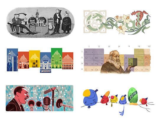
The ‘Google Doodle’ raises awareness about historical, cultural or otherwise important events through different illustrations, animations or interactive games in place of their ususal logo. Even though the styles of these doodles varies greatly, they are still recognisable as the google logo. This is partially because of the context of the doodle’s location on the Google homepage but also because of the framework used to maintain the familiar shapes and/or colours of the original logo.