Back in 2004, Johnson Banks were faced with rebranding the famous UK based homelessness charity, Shelter. At this point, Shelter had already worked for decades to get the homeless off the streets and had largely succeeded in their original task. They were now concentrating their efforts on the issue of the million or so people in the UK living in housing that was simply unfit for human habitation.
In research for the brief, Johnson Banks found that both public and corporate audiences still associated Shelter with people living rough on the streets, in cardboard boxes, and the old, identity was not convincing anybody to think otherwise.
To raise public awareness to the issues that the charity was now facing, the ‘h’ was adapted into a pitched roof. This allowed the conversation to shift to be more focussed on ‘homes’. They carried this idea through all their communications and design, encouraging a narrow palette of colours, straightforward typography and no-nonsense writing styles. The idea of writing ‘h’ words enabled them to brand words without even having to use the logo.

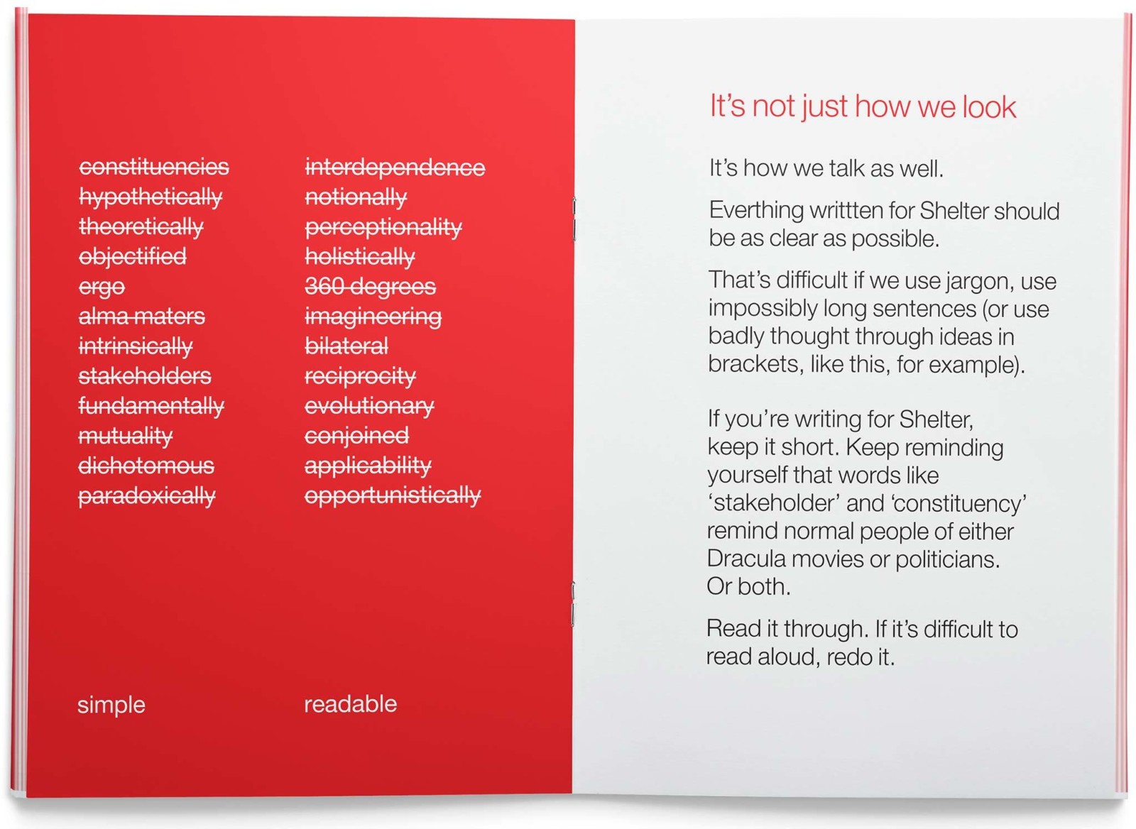
On of the key aspects of this rebrand was when Johnson Banks developed guidelines for tone of voice that urged the staff to be as simple and readable as possible in their writing. This allowed the information to be as accessible to as many people as possible.