
When I saw this meme doing the rounds on Instagram I didn’t know whether to laugh or cry but I definitely felt seen.
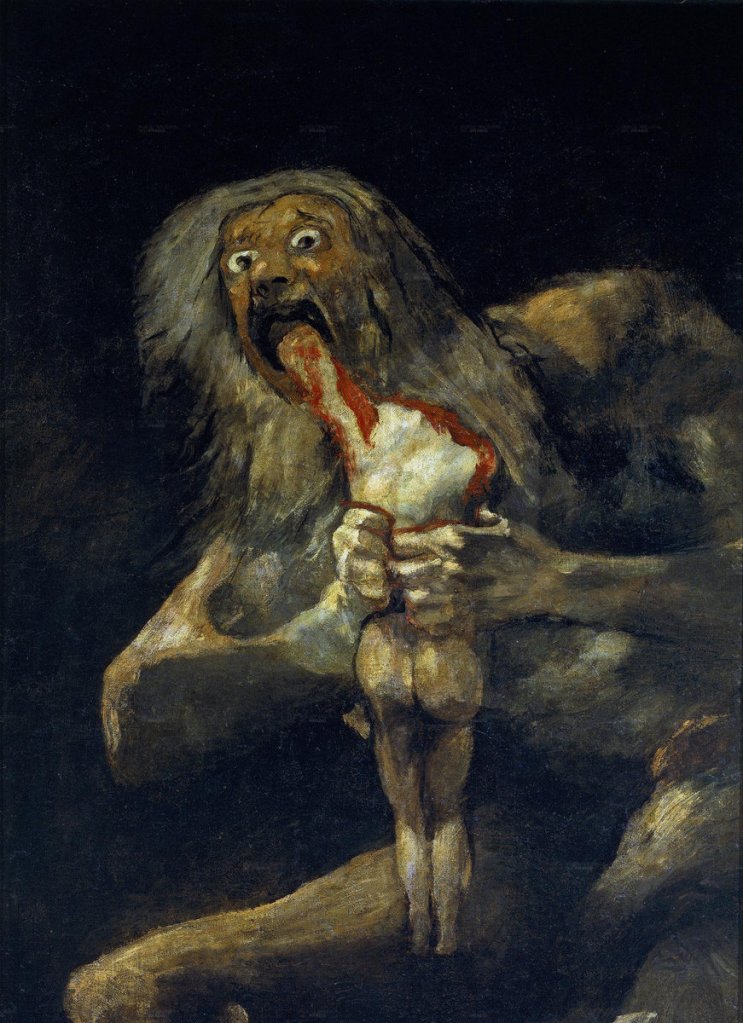
The meme is a parody of Spanish Romanticist artist Francisco Goya’s oil painting Saturn Devouring His Son, painted in 1823. It depicts the Greek myth of the Titan Cronus, who ate each of his children upon their birth out of fear that one of them would overthrow him. 100 years later, this meme version takes a stab at the prevalence of a minimalist, colourful style of vector illustration popping up all over the web.
One of the big catalysts for the prevalence of this style as we know it, was arguably BUCK’s 2017 redesign of Facebook’s Illustration and animation ecosystem. They named this system ‘Alegria’, meaning ‘joy’ in Spanish. On their website BUCK describe the core principles of the brief:

“We designed and built a scalable system rooted in flat, minimal, geometric shapes. The figures are abstracted — oversized limbs and non-representational skin colors help them instantly achieve a universal feel.”
BUCK
The style is particularly prevalent in the tech world. Airbnb, Hinge, Lyft, Airtable, Google, and YouTube have all received the same treatment over the last few years. The issue here is that almost everything else since has reproduced their own versions of Alegria. The ubiquity and saturation of the style is starting to become unsettling. Similar styles are popping up all over the place and I very much doubt that it is taking such a grip on illustration for the right reasons.
It is not the fault of the illustrators, it’s what clients ask for because it’s trendy, cheap and quick to produce, easy for any illustrator to recreate, easy to scale and easy to animate. It isn’t bad visually per say, it does meet the needs of the client well but at what cost? It is so overdone and inoffensive to the point of boredom. Aggressively joyful and approachable to a point that it feels fake. It is especially jarring when this is coming from big tech companies that we now know are invading our privacy and selling our data. But it’s okay if they harvest our data with long blue arms and a smile, right?
I am sorry to say that I have been complicit in this saturation of overused, flat vector design style, full of smiling faces and bendy limbs. During my time working at a small creative/web agency for roughly a year (pre pandemic), I was asked over and over and over again to think up new variations of these same characters for trade and tech companies all over the country. The thought that this was what actual work as a graphic designer was like made me feel pretty disheartened. Is this really all the client wants? I can do it but I take no pride or joy in it. It’s hardly challenging or impressive to copy something that already exists. It made me feel like this was the future. Stale and samey because it works well on the web.
How can it even be possible to rework something this basic to be unique every time? Eventually it all ends up looking the same and has now become shorthand for “We’re a modern and up to date brand! I promise! I SWEAR!”. I honestly feel like working in this style has dulled my own creativity down in the process. When this style or a variation of it is the default for *insert tech company here* then how is that brand expecting to stand out from the crowd? This style now reads as nothing but generic and faceless.
If we can learn anything from the backlash against ‘Alegria’ style illustrations, it’s that both designers and the public are ready for something new to take hold. Eventually, this style will become more widely read as cheap and inauthentic. I think what people actually want during these uncertain times is some authenticity and transparency from brands. Real authenticity, not manufactured blue and purple characters to represent faceless corporations as approachable.