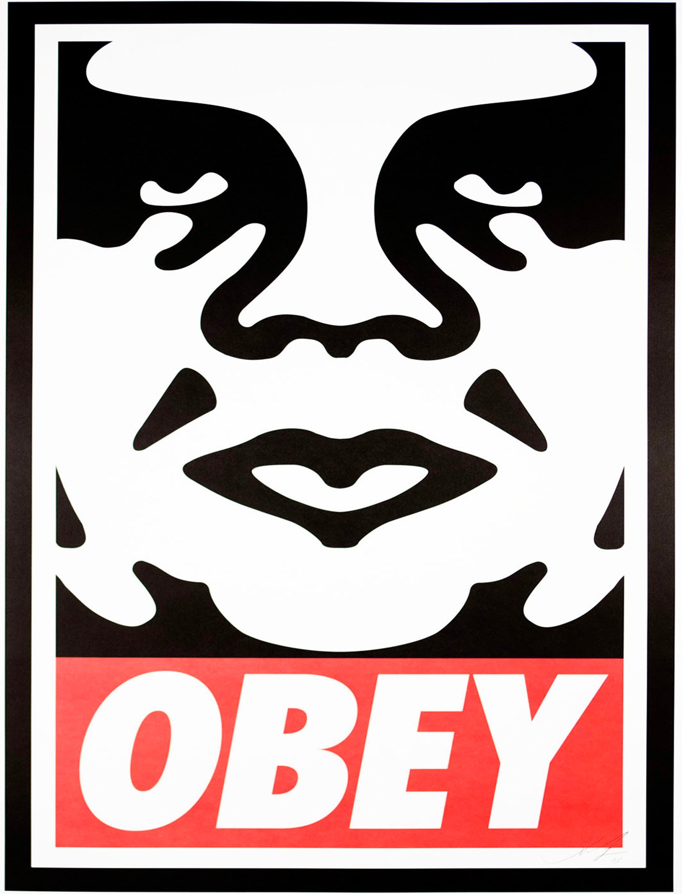
Shepard Fairey emerged out of the skate scene and rose to prominence in the graphic design and street art world with his “Andre the Giant Has a Posse” sticker campaign back in 1989. This would go on to become the basis for Fairey’s OBEY sticker campaign.
“The OBEY sticker campaign can be explained as an experiment in Phenomenology. Heidegger describes Phenomenology as “the process of letting things manifest themselves.” Phenomenology attempts to enable people to see clearly something that is right before their eyes but obscured; things that are so taken for granted that they are muted by abstract observation.
The first aim of phenomenology is to reawaken a sense of wonder about one’s environment. The obey sticker attempts to stimulate curiosity and bring people to question both the sticker and their relationship with their surroundings.”
OBEYGIANT.COM Manifesto
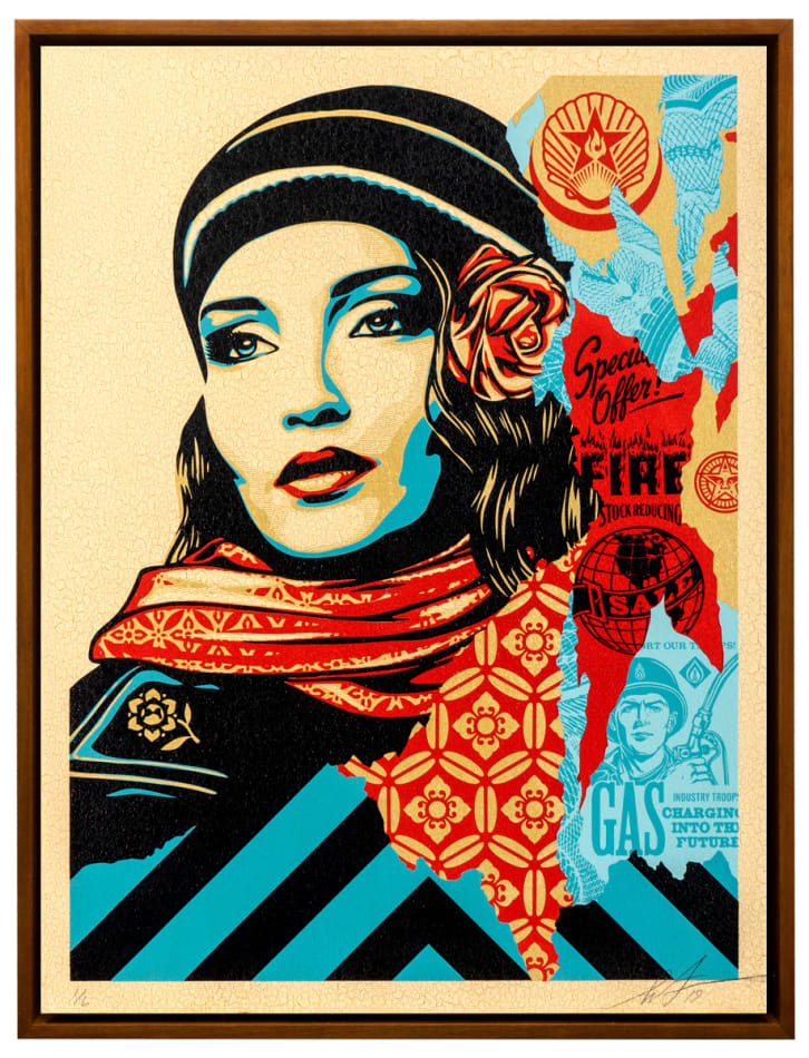
He is perhaps most famous for his iconic ‘Hope’ poster for Barack Obama‘s election campaign in 2008. Since then, his eclectic but well defined style has remained relevant and has inspired many graphic designers.
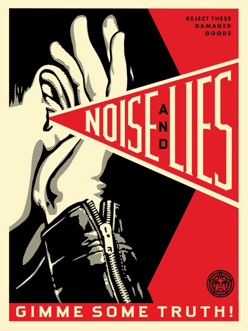
Fairey uses limited colour schemes with black, red and off white being key colours used in much of his work. He also uses geometric shapes to draw the eye to key areas of the design such as the typographic elements or illustration.
I admire the way Fairey ties in political and social issues into his work while maintaining a level of irony and wit. It shows how graphic designers are able to use their work to promote good causes and spread awareness. Fairey spreads his messages through prints, murals, stickers, and posters in public spaces. He often uses stencils to block out each area of solid colour.
Fairey’s influences include movements and styles such as pop art, Russian Constructivism, Art Nouveau and punk. His work is an an amalgamation of these styles with a contemporary twist.
The Constructivists & Agitprop
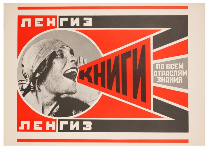
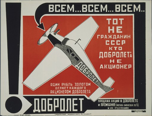
One of Fairey’s most obvious influences is the work of ground breaking Soviet artist, sculptor, photographer, and graphic designer, Alexsander Rodchenko.
Rodchenko became one of the founding members of the Constructivist Working Group in 1921. Formed during the Russian Revolution, the group set out to question the fundamental properties of art and asked what its place should be in a new society. The Constructivists defined art making as a form of professional expertise and labour like any other, and not as a spiritual calling. They challenged the idea of the work of art as a unique commodity, explored more collective ways of working, and looked at how they could contribute to everyday life through the arts and design.
The Constructivists contributed to early agitprop designs. Today the term ‘agitprop’ has come to refer to any overtly political artwork. The term’s origin is a contraction of the Russian words ‘agitatsiia’ and ‘propaganda’ in the title of the Department of Agitation and Propaganda set up in 1920 by the Central Committee of the Soviet Communist Party.
Interestingly, this was one of the first periods in history when female artists were valued as highly as their male counterparts due to equality of the sexes being an important Communist principle.
A notable example was Lyubov Popova. From 1921 to 1924, Popova had started entirely working on Constructivist projects, often collaborating with Rodchenko to produce propaganda and educational posters. Because of the low literacy rates in Tsarist Russia, these posters needed to be boldly designed, with a clear message. They adapted their Constructivist principles and innovative techniques such as photomontage to fit the purpose.

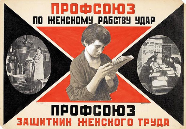
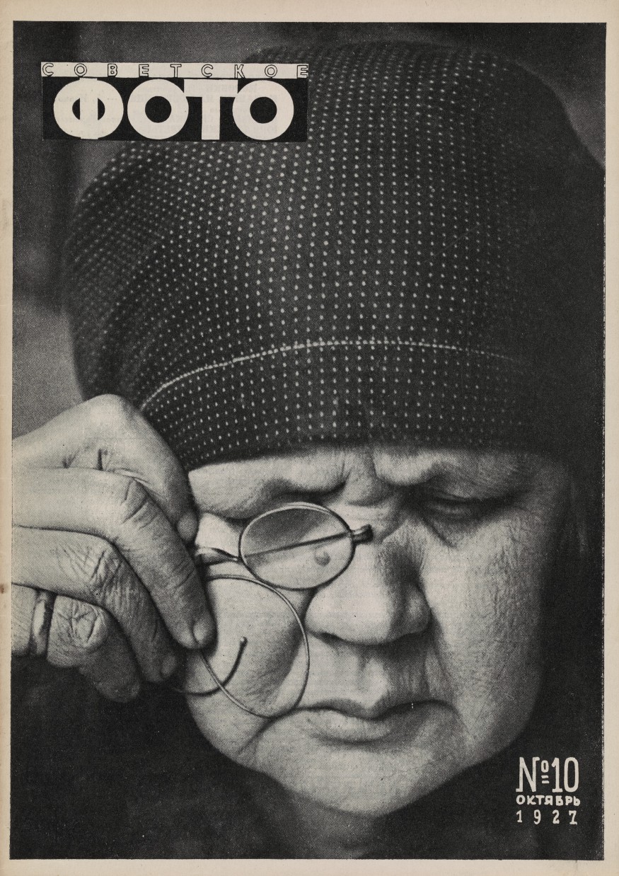
Alexander Rodchenko began to experiment with photomontage and the composition of images after purchasing a handheld camera on a trip to Paris in 1925.
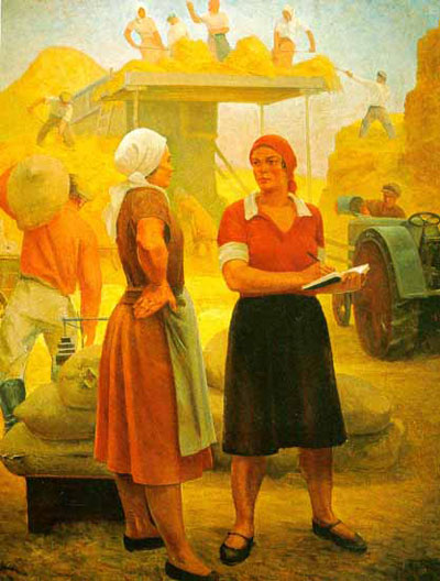
In the early 1930s he began to use photography as a tool for social commentary. He depicted the disparity between the idealized and lived Soviet experience. The images he made contrasted with Socialist Realism, which was declared the official style of art in the Soviet Union in 1934. This style favoured positive, heroic and glorified representations of everyday life and ‘Communist values’.
I think it is pretty clear to see today which style was more ahead of it’s time…
