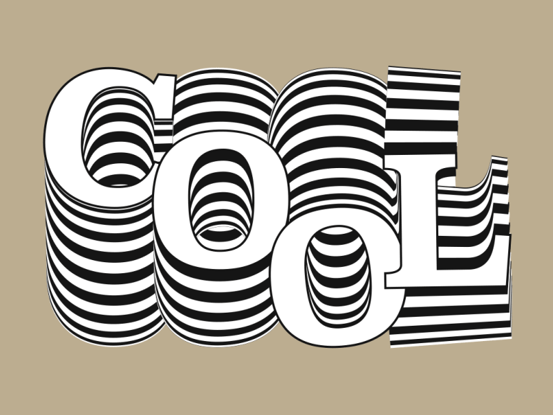
How location and culture impacts on the vision and thought processes behind a designer’s work.
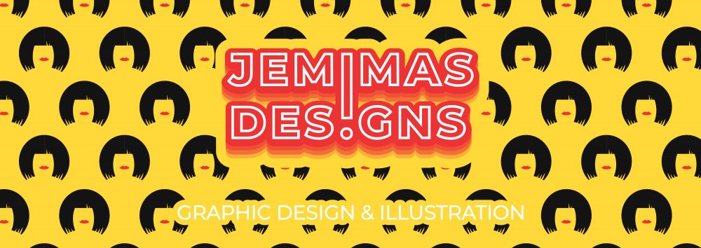
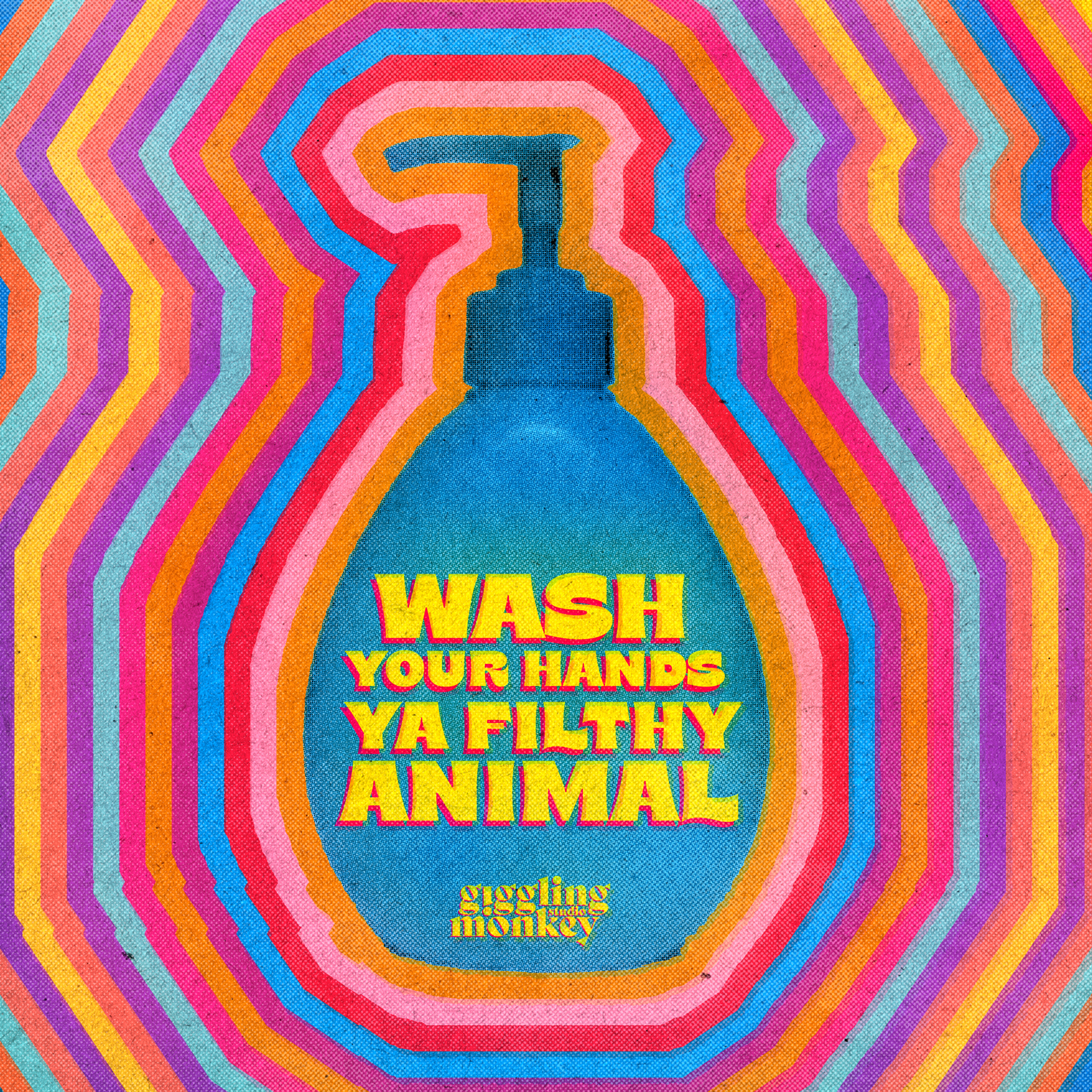
Mehek Malhotra is a Mumbai based graphic designer and artist. She is the founder and art director of Giggling Monkey Studio, an incredibly kitschy, colourful and fun brand design design studio.
“We help companies and brands become understandable🍳 and meaningful🍸. We think unforgettable ideas stem from authenticity.🦖”
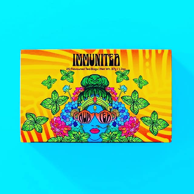
Mehek claims that her inspiration comes to her by her everyday interactions, fleeting thoughts and sights from everyday life in Mumbai. There’s no better source of inspiration for her than the tea stalls across the country.
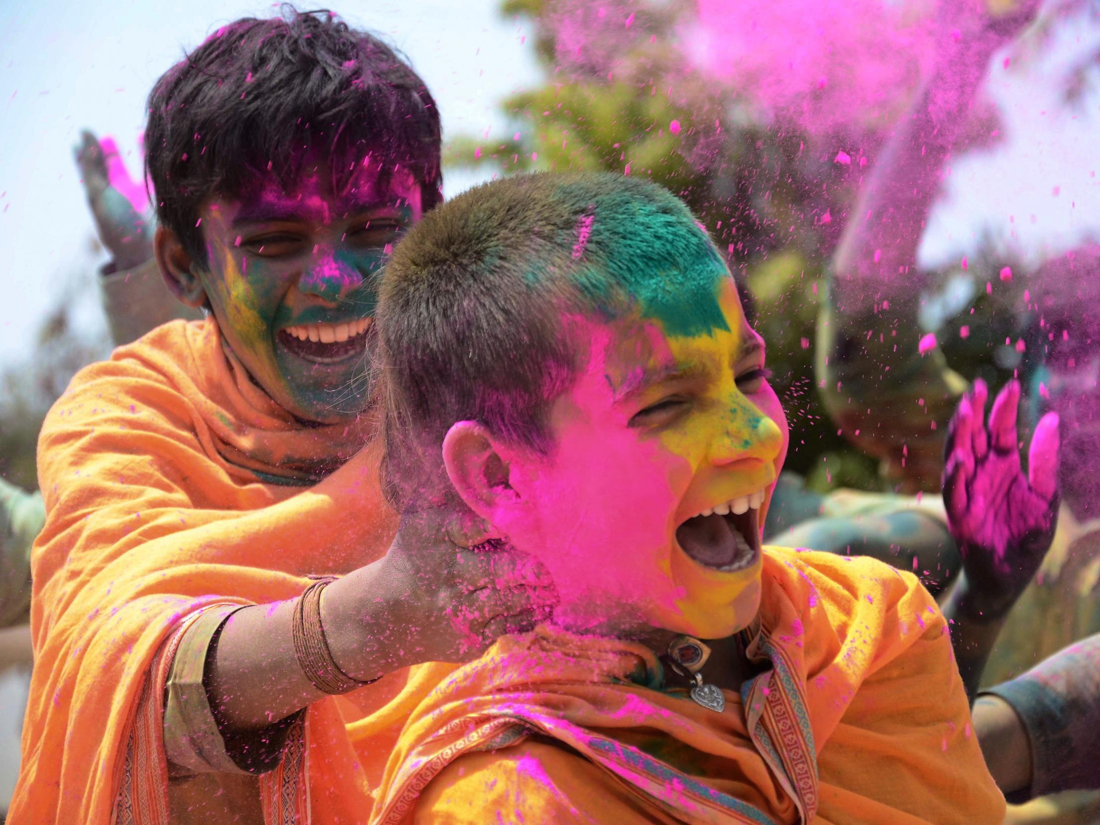
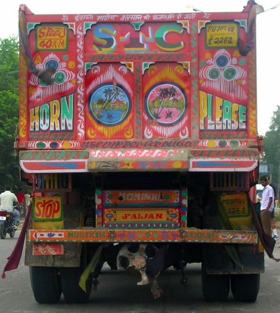
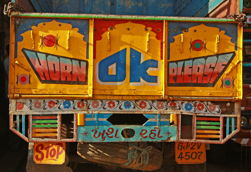
India has such a strong cultural connection to the use of vivid colours in almost every possible sense. For example, the ancient Hindu festival of Holi is the festival of colours. It is one of the most widely celebrated festivals in the country and signifies the triumph of good over evil. There are countless other traditions from India’s widely varying regions and religions which use colour and pattern to create symbolism. Even something as mundane as trucks are conventionally decorated top to bottom in colourful patterns and crazy hand painted typography calling out ‘HORN PLEASE’ to passers by. This rich history of colour and pattern are clear to see in Mehek’s work.
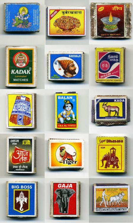
Mehek’s work also has a clear influence from the design of one rupee matchboxes which can be found littered almost anywhere on the subcontinent. The imagery on the boxes include anything from religious figures, historical figures, Bollywood stars, foreign brands, cartoon characters, everyday objects and exotic animals.
In this video, Mehek describes India as an interesting mix of culture, language, geography, food and music. She explains how she grew up as an ‘army kid’ travelling all over different parts of India and therefore absorbing different aspects of the country’s incredibly varied identity. She also talks about how she managed to use the local colours of Gujarat for the branding of Fangirl Live festival in order to make it feel familiar to local people but with a modern and fresh twist to it.
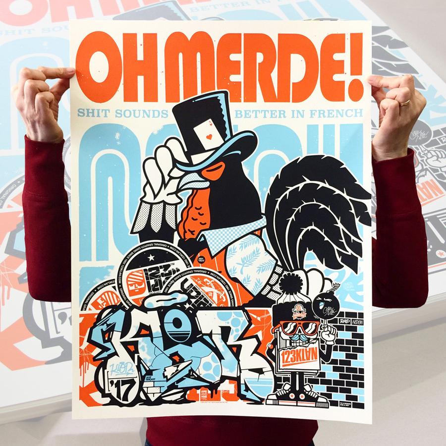
“When street knowledge meets technology and graffiti melds with graphic design”
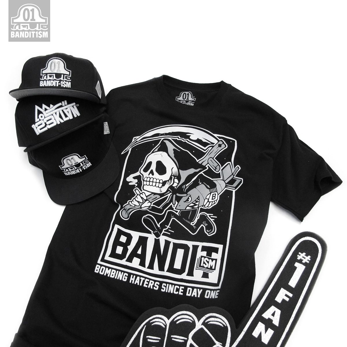
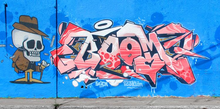
123KLAN are a graffiti crew based in Montreal, Canada. They were founded in 1992 by French duo Scien and Mrs Klor. Over the years, they have managed to adapt their skills in graffiti art to open a creative studio focussed on graphics and branding. They have also been able to launch their own streetwear label BANDIT1SM x 123KLAN as well as being asked to work on collections for Adidas, Nike and Stussy. Another string to 123KLAN’s bow is animation and video game work.
I really admire how they have managed to intergrate all of these different mediums into one central brand while keeping their distinctive graffiti influenced look to everything they do. Each specialism is included on one website but, they keep each aspect of their practice separated into categories as if they are different departments of the same thing. As a designer who is uncertain about where I fit on a spectrum of branding to illustration, this is something I will definitely think about for the future. It proves that there is no need to pigeonhole yourself as just an ‘illustrator’ or a ‘branding expert’ or an ‘artist’. 123KLAN are proof that you can adapt any relevant creative skill you may have at any stage of your career to fit into your practice.
How Contemporary Graphic Designers / Agencies Apply Narrative to Their Work
Halo, a Bristol based creative agency, describe their use of narative in branding as:
We position brands with techniques and insights that affect transformative change. This can be building purpose, strategic intent, proposition, growth planning, brand architecture or portfolio rationalisation and alignment. A vision for the future or a vehicle for managing adaptive challenges.
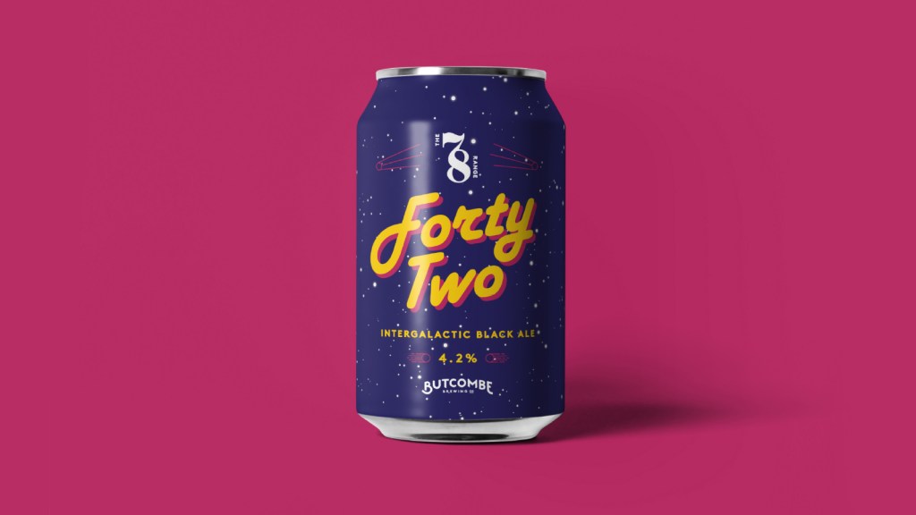
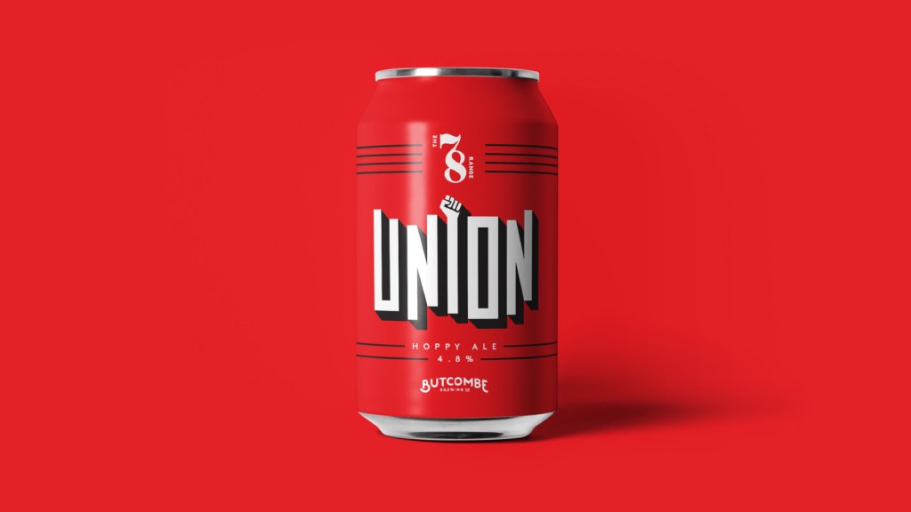
We can see these techniques applied in the work Pedro Oyabide and the team at Halo produced for Butcombe Brewing Co.
Halo managed to shape a new strategic brand narrative, defining and creating opportunities for growth in the overcrowded ale and craft beer market. They completely updated the of visual identity and design for Butcombe’s traditional ales and created an entire brand architecture for a limited edition range of craft beers. The rebrand won critical acclaim, and a World Beer Medal for brand design.
The most notable use of narrative with this rebrand is the ‘78 Range. Each ale is limited batch with a unique name and design created in honour of a landmark event or personality from the year of the Brewery’s birth, 1978. This gives the brewery a way to celebrate their history and share it with their customers who may be enticed by the retro themes and aesthetics used. Halo were really committed to the narrative, including a Hitchhikers Guide to the Galaxy themed beer, a beer to celebrate ‘the Winter of Discontent’ strikes and even a space invaders themed beer amongst many others. This would help to stir up nostalgic feelings for anyone who was around in ’78 or, to serve up a slice of the brand’s history for those who weren’t.
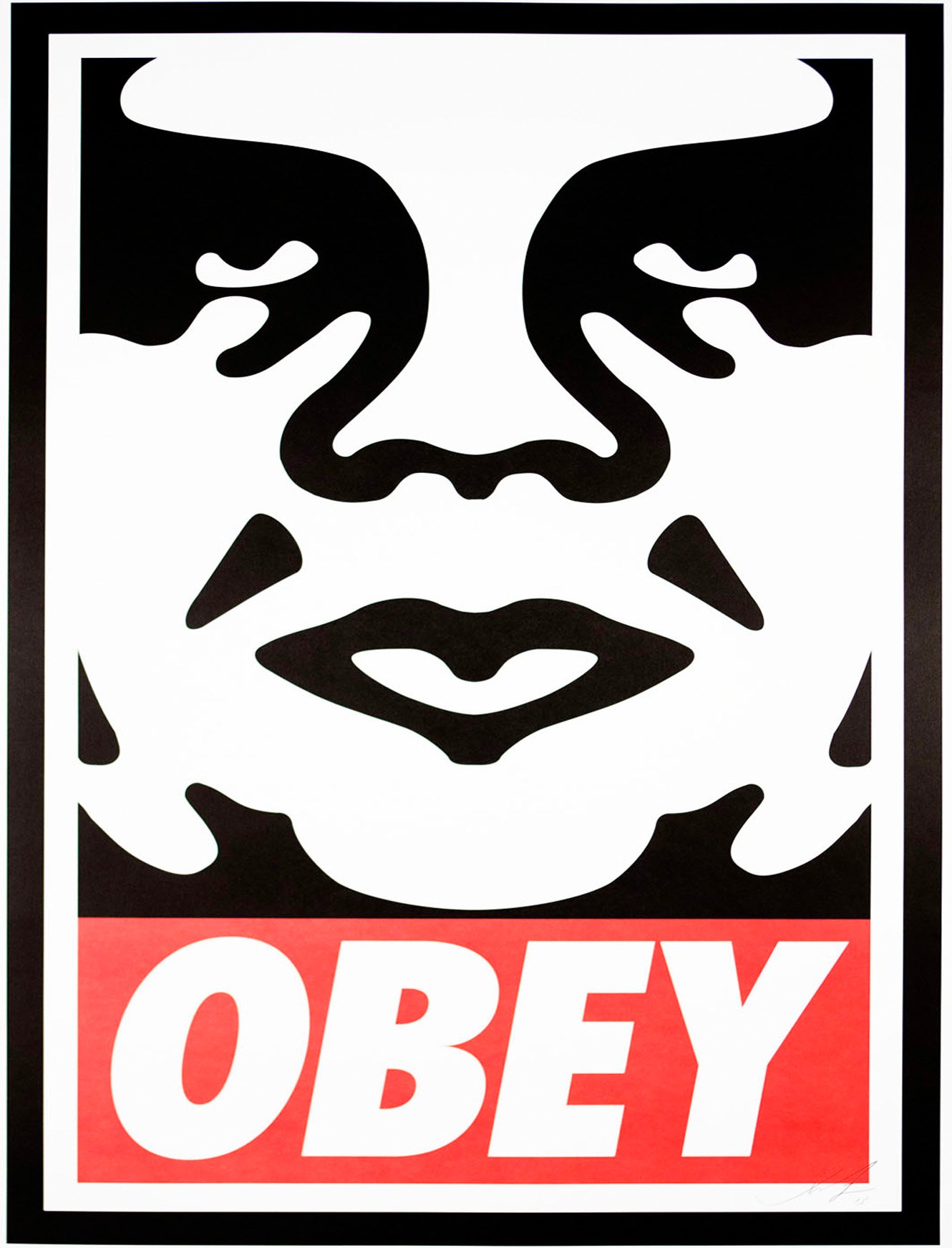
Shepard Fairey emerged out of the skate scene and rose to prominence in the graphic design and street art world with his “Andre the Giant Has a Posse” sticker campaign back in 1989. This would go on to become the basis for Fairey’s OBEY sticker campaign.
“The OBEY sticker campaign can be explained as an experiment in Phenomenology. Heidegger describes Phenomenology as “the process of letting things manifest themselves.” Phenomenology attempts to enable people to see clearly something that is right before their eyes but obscured; things that are so taken for granted that they are muted by abstract observation.
The first aim of phenomenology is to reawaken a sense of wonder about one’s environment. The obey sticker attempts to stimulate curiosity and bring people to question both the sticker and their relationship with their surroundings.”
He is perhaps most famous for his iconic ‘Hope’ poster for Barack Obama‘s election campaign in 2008. Since then, his eclectic but well defined style has remained relevant and has inspired many graphic designers.
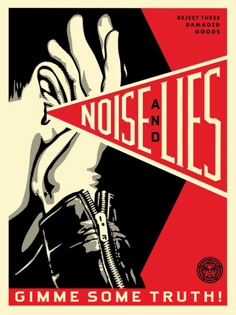
Fairey uses limited colour schemes with black, red and off white being key colours used in much of his work. He also uses geometric shapes to draw the eye to key areas of the design such as the typographic elements or illustration.
I admire the way Fairey ties in political and social issues into his work while maintaining a level of irony and wit. It shows how graphic designers are able to use their work to promote good causes and spread awareness. Fairey spreads his messages through prints, murals, stickers, and posters in public spaces. He often uses stencils to block out each area of solid colour.
Fairey’s influences include movements and styles such as pop art, Russian Constructivism, Art Nouveau and punk. His work is an an amalgamation of these styles with a contemporary twist.
The Constructivists & Agitprop
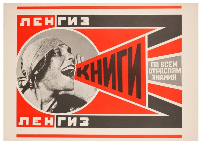
One of Fairey’s most obvious influences is the work of ground breaking Soviet artist, sculptor, photographer, and graphic designer, Alexsander Rodchenko.
Rodchenko became one of the founding members of the Constructivist Working Group in 1921. Formed during the Russian Revolution, the group set out to question the fundamental properties of art and asked what its place should be in a new society. The Constructivists defined art making as a form of professional expertise and labour like any other, and not as a spiritual calling. They challenged the idea of the work of art as a unique commodity, explored more collective ways of working, and looked at how they could contribute to everyday life through the arts and design.
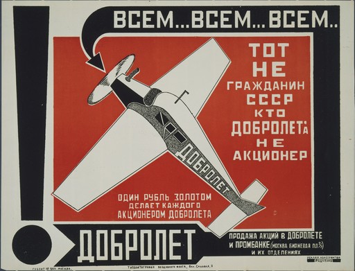
The Constructivists contributed to early agitprop designs. Today the term ‘agitprop’ has come to refer to any overtly political artwork. The term’s origin is a contraction of the Russian words ‘agitatsiia’ and ‘propaganda’ in the title of the Department of Agitation and Propaganda set up in 1920 by the Central Committee of the Soviet Communist Party.
Interestingly, this was one of the first periods in history when female artists were valued as highly as their male counterparts due to equality of the sexes being an important Communist principle.
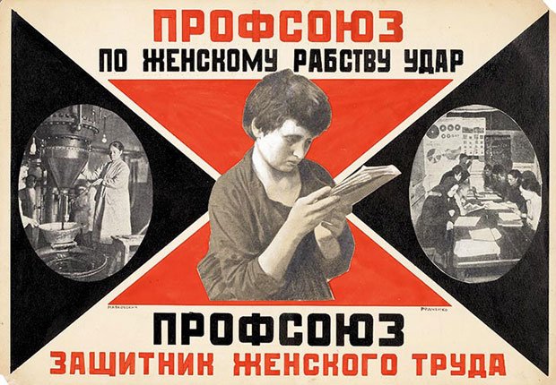
A notable example was Lyubov Popova. From 1921 to 1924, Popova had started entirely working on Constructivist projects, often collaborating with Rodchenko to produce propaganda and educational posters. Because of the low literacy rates in Tsarist Russia, these posters needed to be boldly designed, with a clear message. They adapted their Constructivist principles and innovative techniques such as photomontage to fit the purpose.
Lyubov Popova /Protect your sister from prostitution 1922Alexander Rodchenko / Trade Union is a Defender of Female Labour 1925
Alexander Rodchenko began to experiment with photomontage and the composition of images after purchasing a handheld camera on a trip to Paris in 1925.
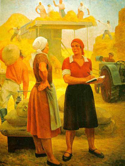
In the early 1930s he began to use photography as a tool for social commentary. He depicted the disparity between the idealized and lived Soviet experience. The images he made contrasted with Socialist Realism, which was declared the official style of art in the Soviet Union in 1934. This style favoured positive, heroic and glorified representations of everyday life and ‘Communist values’.
I think it is pretty clear to see today which style was more ahead of it’s time…
Motion graphics are simply an animated graphic. Although motion graphics are a form of animation, the purpose of using motion graphics is not the same as traditional animation which seeks to depict a fully fleshed out story and characters. Instead, motion graphics are used to emphasize an idea or point, to quickly illustrate a narrative, to convey complex ideas which are easier to display visually, or simply to engage an audience more than a static graphic would by catching their attention with movement.
Motion graphics are shorter than most traditional animation, more often than not they are only a couple of seconds long and play on a loop. This is because one of the most popular formats for this style of graphic is the GIF which has become easier to share online in recent years. We are also seeing more and more video integration on the web allowing for the use of longer motion graphics and animations.
Motion Graphics are growing in popularity as the role of graphic design continues to shift towards digital platforms and those platforms advance to allow new possibilities. We are now seeing the use of motion graphics online as logos, illustrations, integrated into websites, email signatures, to display statistics and a lot more. More brands than ever have began to shift towards video marketing since it is one of the most effective ways for them to engage their audience and promote sharing online. Motion graphics either bridge that gap between graphics and video or they help to enhance the video and place a more unique stamp on the content.
The web is not the only digital space where we see motion graphics popping up more frequently. As more screens begin to be implemented into the public space as billboards, menus etc. more designers are turning to motion graphics to liven up these displays with an up to date visual.
Although motion graphics had been used in film and television for the majority of the 20th Century up until today, this particular style of motion graphic used on digital platforms is something which has become a trend in recent years which only looks to be expanding as technology progresses. This shift is leading many graphic designers to learn animation skills and software in order to have motion graphics as a resource they can provide.
Currently the most popular and common software used to produce these kinds of motion graphic include Adobe Photoshop, Adobe After Effects, Adobe Illustrator, Adobe Premier Pro, and Cinema 4D.
Kinetic Typography
Kinetic typography is a great way to introduce movement to text as a way to grab attention and emphasise the meaning. These examples are from Madrid based animator/graphic designer, Cecilia Erlich.
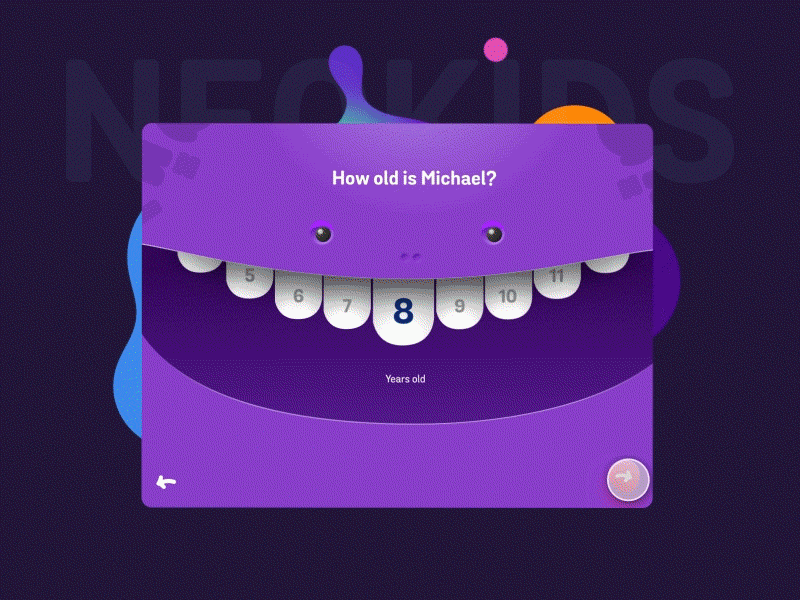
Onboarding Animations
Onboarding Animations are becoming a popular way to introduce a new user to the features of an app or website. Their purpose is to concisely guide a user through the available functions and how to use them. An example is this onboarding animation designed for Neo Kids, a kid friendly video on demand app. It was designed by Minh Phram for Fantasy
Motion graphics and explainer videos seem to go hand in hand. They are perfect for breaking down complex or dense information into something much easier to focus on. One of my favourite examples is Munich based animation studio/design agency, Kurzgesagt. They also happen to be one of the most popular Science channels on YouTube with videos available in English, German and Spanish.
Kurzgesagt work as an in-house team consisting of researchers, writers, designers, animators and producers. They also collaborate with a wide network of experts, journalists, voice actors and sound designers.
What I really love about these videos is the way they can make any topic seem interesting and easy to digest no matter how complex. They work as if they are animated infographics with a load of added extras. The style of the animation is similar to other flat vector based web graphics that we see everywhere but instead of making it all as minimal as possible, they go for a sort of ‘maximalist minimalist’ approach. Each scene is packed full of life, movement and colour.
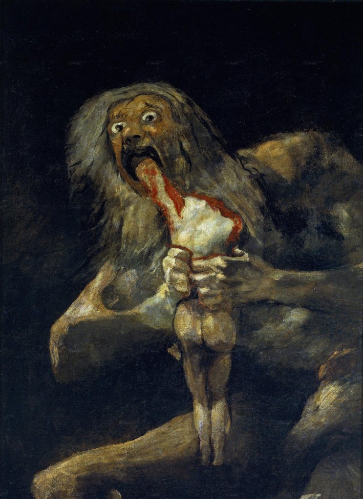
When I saw this meme doing the rounds on Instagram I didn’t know whether to laugh or cry but I definitely felt seen.
The meme is a parody of Spanish Romanticist artist Francisco Goya’s oil painting Saturn Devouring His Son, painted in 1823. It depicts the Greek myth of the Titan Cronus, who ate each of his children upon their birth out of fear that one of them would overthrow him. 100 years later, this meme version takes a stab at the prevalence of a minimalist, colourful style of vector illustration popping up all over the web.
One of the big catalysts for the prevalence of this style as we know it, was arguably BUCK’s 2017 redesign of Facebook’s Illustration and animation ecosystem. They named this system ‘Alegria’, meaning ‘joy’ in Spanish. On their website BUCK describe the core principles of the brief:
Facebook Alegria / BUCK
“We designed and built a scalable system rooted in flat, minimal, geometric shapes. The figures are abstracted — oversized limbs and non-representational skin colors help them instantly achieve a universal feel.”
The style is particularly prevalent in the tech world. Airbnb, Hinge, Lyft, Airtable, Google, and YouTube have all received the same treatment over the last few years. The issue here is that almost everything else since has reproduced their own versions of Alegria. The ubiquity and saturation of the style is starting to become unsettling. Similar styles are popping up all over the place and I very much doubt that it is taking such a grip on illustration for the right reasons.
It is not the fault of the illustrators, it’s what clients ask for because it’s trendy, cheap and quick to produce, easy for any illustrator to recreate, easy to scale and easy to animate. It isn’t bad visually per say, it does meet the needs of the client well but at what cost? It is so overdone and inoffensive to the point of boredom. Aggressively joyful and approachable to a point that it feels fake. It is especially jarring when this is coming from big tech companies that we now know are invading our privacy and selling our data. But it’s okay if they harvest our data with long blue arms and a smile, right?
I am sorry to say that I have been complicit in this saturation of overused, flat vector design style, full of smiling faces and bendy limbs. During my time working at a small creative/web agency for roughly a year (pre pandemic), I was asked over and over and over again to think up new variations of these same characters for trade and tech companies all over the country. The thought that this was what actual work as a graphic designer was like made me feel pretty disheartened. Is this really all the client wants? I can do it but I take no pride or joy in it. It’s hardly challenging or impressive to copy something that already exists. It made me feel like this was the future. Stale and samey because it works well on the web.
How can it even be possible to rework something this basic to be unique every time? Eventually it all ends up looking the same and has now become shorthand for “We’re a modern and up to date brand! I promise! I SWEAR!”. I honestly feel like working in this style has dulled my own creativity down in the process. When this style or a variation of it is the default for *insert tech company here* then how is that brand expecting to stand out from the crowd? This style now reads as nothing but generic and faceless.
If we can learn anything from the backlash against ‘Alegria’ style illustrations, it’s that both designers and the public are ready for something new to take hold. Eventually, this style will become more widely read as cheap and inauthentic. I think what people actually want during these uncertain times is some authenticity and transparency from brands. Real authenticity, not manufactured blue and purple characters to represent faceless corporations as approachable.
Ruth Mora, known on instagram as @_meanmachine, is an LA based Illustrator and Comix Artist. She mostly sells risograph prints online and promotes herself through her instagram page. She uses a combination of hand drawn illustration using brush pens which is then scanned, edited and coloured digitally. She also uses vector illustration.
I really appreciate the fact that she doesn’t shy away from expressing difficult emotions, as well as being politically and socially conscious by using wit and humour. She accomplishes this both in her naive, punk influenced illustration style as well as her choice of copy.
Since the themes of her work are so relatable to people, her work is often shared through instagram stories which increases her exposure. She currently has over 148K followers as a result. This is something I will bare in mind when trying to produce my own work as I feel like what I am currently lacking is any work that meets this point between personal, witty and stylish. If content is relatable, people are much more likely to share but more importantly, they connect with you and your work on a deeper level.
“I guess at the core of it, I’m an artist. But I like to say I’m an illustrator and designer within the professional realm. There’s so many different types of artists and adding the title of illustrator and designer sort of helps distinguish what kind of work I do, I think. I still have a hard time fitting myself and my work into a box, though.”
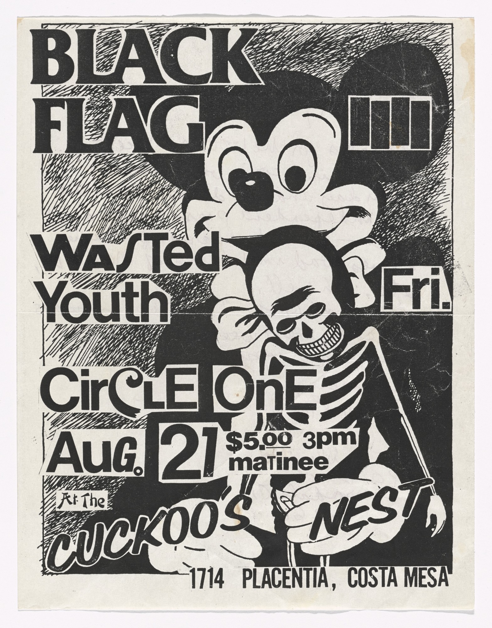
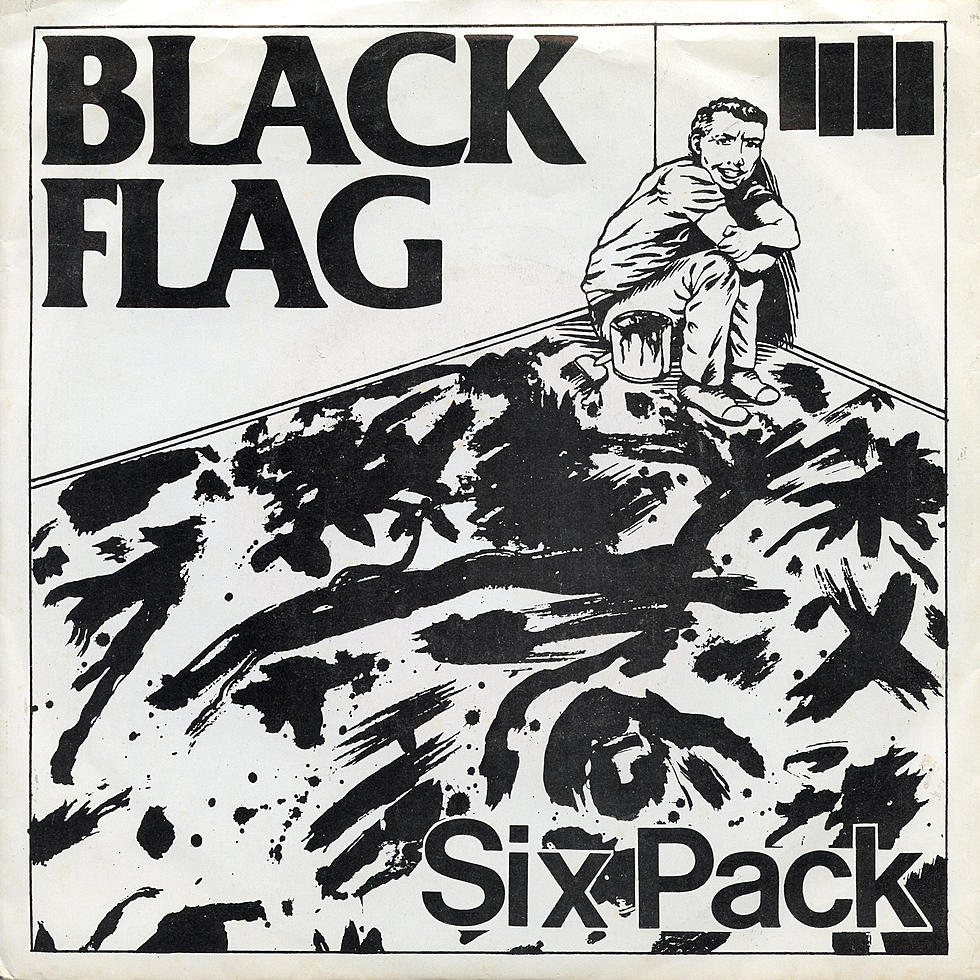
In 1976, self taught punk artist, Raymond Pettibon got his start. He began designing album covers, flyers, posters and zines for the southern Californian punk band, Black Flag and other groups on SST Records, owned and operated by his older brother, Greg Ginn.
He gains inspiration from comics, cartoons, politics, and other pop culture iconography and works in a style of handwritten text and intentionally rough doodled illustrations which he blacks out areas with India ink. He mostly works in black and white but occasionally will introduce colour using pencil, watercolour, collage, gouache or acrylic paint.
In the 1980s, flyposting and handing out flyers was practically the only way to distribute the controversial material to a wider audience at a time when it was almost impossible to gather momentum to a counter cultural movement such as punk in conventional media. Pettibon’s work was perfectly suited to being photocopied over and over again for that purpose.
Back in 2004, Johnson Banks were faced with rebranding the famous UK based homelessness charity, Shelter. At this point, Shelter had already worked for decades to get the homeless off the streets and had largely succeeded in their original task. They were now concentrating their efforts on the issue of the million or so people in the UK living in housing that was simply unfit for human habitation.
In research for the brief, Johnson Banks found that both public and corporate audiences still associated Shelter with people living rough on the streets, in cardboard boxes, and the old, identity was not convincing anybody to think otherwise.
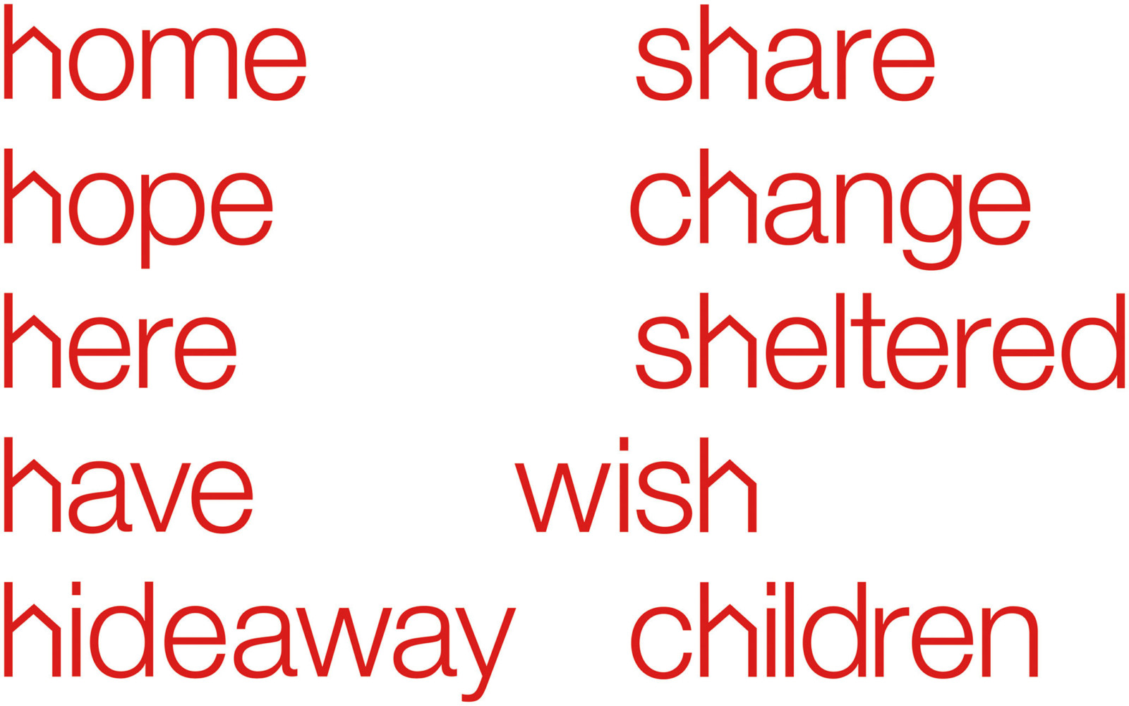
To raise public awareness to the issues that the charity was now facing, the ‘h’ was adapted into a pitched roof. This allowed the conversation to shift to be more focussed on ‘homes’. They carried this idea through all their communications and design, encouraging a narrow palette of colours, straightforward typography and no-nonsense writing styles. The idea of writing ‘h’ words enabled them to brand words without even having to use the logo.
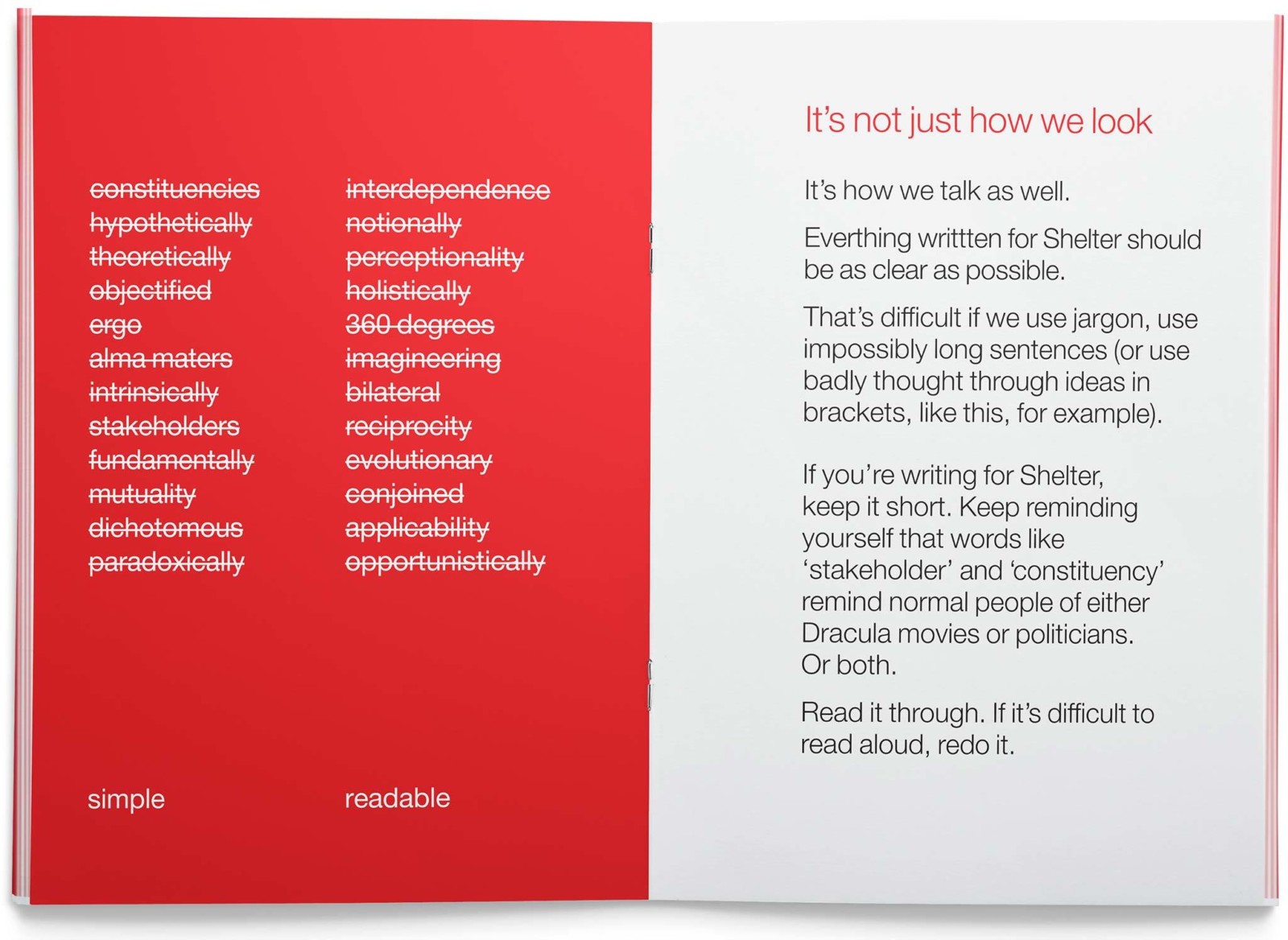
On of the key aspects of this rebrand was when Johnson Banks developed guidelines for tone of voice that urged the staff to be as simple and readable as possible in their writing. This allowed the information to be as accessible to as many people as possible.