Typography in Everyday Objects
Reply


Alison Carmichael has been in the industry for over 20 years. Her distinctive style of hand lettering has been used for some huge brands including KFC, Boots and Cadbury’s to name but a few.

Her style is best known for it’s flowing cursive letterforms which are popular with brands as it gives a more personal feel than something produced digitally. By hand lettering instead of using pre-existing fonts, Carmichael is able to create something bespoke which matches the tone her clients are aiming for. SInce so much of typography today is produced digitally, this makes her work stand out.
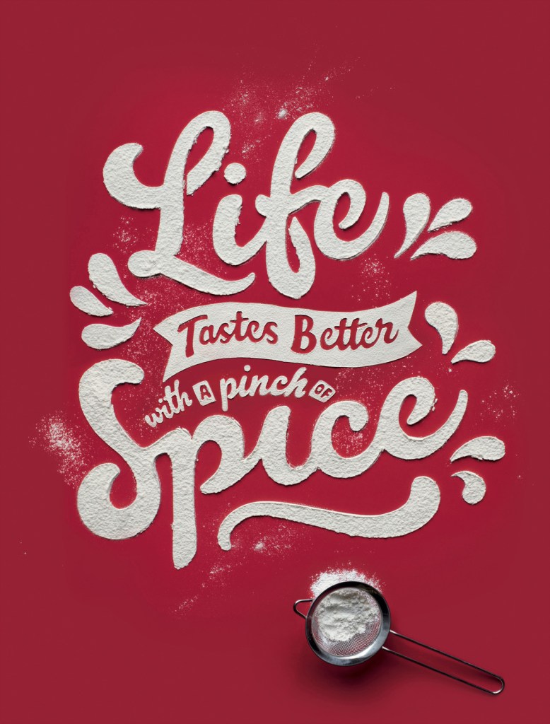
Carmichael’s work goes far beyond standard handlettering practices. She often uses unconventional materials to produce her typography. For example, she used ketchup to produce the cover of Time Out London’s Cheap Eats issue.

It is her signitaure cursive hand lettering but using ketchup as the medium contrasts such a precise and beautiful style. It invites the viewer to smile at the contrast and ask questions. How did she get it so neat?
Carmicheal discusses her process for this piece in an interview with Pen Heaven. She states that ” it’s all about scale!! With something like the ketchup on the cover of time out for the “cheap eats” issue, it appeared that the lettering was about the same size as a normal dinner plate. It was, in fact much bigger than that and resized digitally. I created the artwork in pencil on paper and then enlarged it and printed it out at the size I wanted to create it. Then I used graphite rubdown paper to create a feint outline of the lettering on the surface that it was being photographed on and then carefully filled and built up the shapes of the letters using the wrong end of a teaspoon – So no clever digital trickery there!”.
Further examples of this approch in her work include using flour for KFC and sprinkles in a piece called There’s a Good Girl which was produced for the Viva Women Exhibition put together by Jo Wallace of Saatchi and Saatchi to showcase the work of ground breaking female creatives.


Ray Gun was an alternative rock magazine founded in 1992 by art director David Carson alongside editors Randy Bookasta and Neil Feineman. The publication ran for seven years.
Carson’s signiature style is seen throughout the magazine’s typography, layout and choice of imagary. This consits of a rejection of the conventional grid format and typographic rules. Often lines of text would be spread over two pages, or simply cut off on the edge of the page. Type was blown up to different sizes that did not indicate any conventional sense of hierarchy. Type overlapped in places. At time parts of the magazine were barely legible. This did not bother Carson as he was more concerned about conveying expression. Carson allowed the feeling of each article to dictate the way it looked. He would respond to the music being spoken about or the tone of the article and try to replicate that feeling visually.
Carson speaks about this approach in an interview for designboom where he talks about the cover of their biggest selling issue. The issue’s cover features no cover lines, instead it simply features a photograph of Keith Richards. Carson justifies this in the interview as “the editor had given me a few cover lines including one about keith richards coming clean about sex, drugs, rock and roll etc. I looked at this portrait and realized you really didn’t need to say anything else, the landscape of his face said it all.”

In 1959 the adverising agency Doyle Dane Bernbach (DDB) were tasked with marketing the Volkwagen Beetle to an American market. The issue they had was pitching a car that was considered small, ugly and inexpensive compared to the large, angular and stylish cars that were being produced in America at the time.
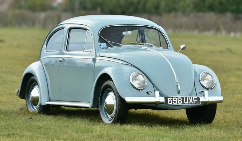
On top of this, the beetle owed it’s origins to the Nazi regime in a time where those connotations were still very fresh in the public’s mind and would have been off putting to many. The car was intended to be for the ordinary working German people. Not a flashy fashion statement as was popular in the USA.
So how did DDB not only manage to sell the beetle to the USA, but also cause a revolution in advertising in the process?
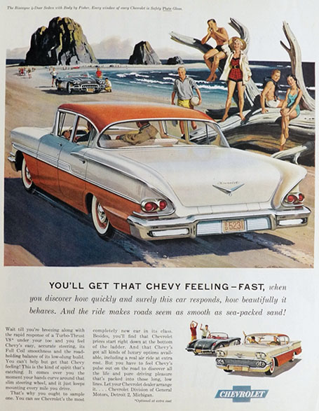
This Chevrolet ad from 1958 is typical of it’s time. The ad sells the car through it’s Unique Selling Proposition (USP), meaning that it simply highlights all of the benefits of the product that it’s competitors did not have. It also tries to sell the car through selling the lifestyle. The imagary shows young, stylish and attractive individuals enjoying themselves as if to say “This could be you!”. This applied to all manner of advertisments, not just in the automotive industry. As a result, this method of advertising became incredibly repetitive which made the public begin to switch off.
Along came DDB to flip the standard practices used in post-war adverising on their head.
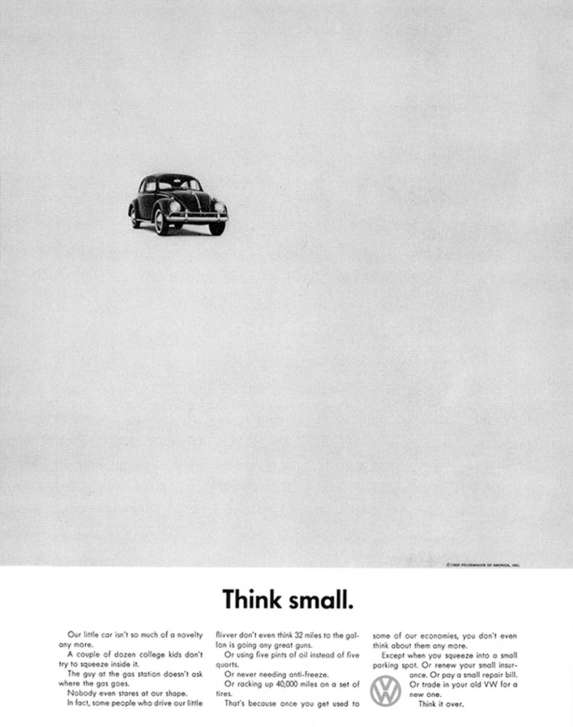
Instead of trying to sell the car as part of the American lifestyle, surrounded by smiling faces in suburbia, or looking out of place next to the typical cars of the era, the beetle is alone in a sea of white space. This would have demanded the attention of the viewer to be focused on the unique design of the car itself. At the time, the monochrome ad would have really stood out in a magazine contrasting the large colourful illustrations people were used to (and becoming bored of) seeing in advertisments.
The minimal design indicated honesty and simplicity. The headline “Think small.” was so understated that it would have been shocking to see in an advertisment at the time. This was also supported by the body text which told the truth about the car. Nothing was exaggerated and it was written with an almost self depreciating tone. The ad makes a statement about how this car was nothing like the desirable cars of the time but in a good way – it was practical and affordable.
Instead of using the full name ‘Volkswagen’, it was shortened to VW to reduce the negative connotations of it being a German car and to make it sound simpler and cooler.
This ad marked a shift in the way both consumers and advertisers thought about advertising. It was a shift towards transparency. Adverts didn’t need to talk down to consumers and simply hammer home the selling points, the tone of voice used became just as important. It was also part of a stylistic shift from the use of illustration to the use of photography in advertisment.
