The Old & the New – Pentagram

Pentagram pride themselves as being the world’s largest independent design agency. They consist of a team of 24 designers who produce graphics and identity, products and packaging, exhibitions and installations, websites and digital experiences, advertising and communications, and sound and motion.

They claim to be unique in their structure as the only major design studio where the owners of the business are the creators of the work and serve as the primary contact for every client. This allows the designers, whether working individually or as a team, to tackle a design problem with personal commitment, passion and intelligence.

I believe that having pride and passion for the work you produce is so important as a designer because it enables you to be more invested when it comes to solving a problem. If you feel too much as though you’re just a service being paid for by ‘insert brand here’ then the work is much more likely to come out looking stagnant. If you are working hand in hand with the client, it is easier to really get a sense for what the brand are about.

When it comes to brand identity, Pentagram are clearly masters of retaining the core values of a brand at the same time as developing something unique and full of personality. This ability comes from the direct communication between designer and client. The way designers at Pentagram are encouraged to collaborate also allows them to approach a problem from different points of view, allowing for a more creative outcome.

By treating designers as both individuals as well as a collective, each designer at Pentagram seems to be able to work to their own strengths, opinions and values which come together to develop the best solution for the client.

Pentagram / Emily Oberman: Birds of Prey visual identity

“It was truly about doing the work and not about bureaucracy. The partners are all generous and thoughtful about design and collaboration. It is not like joining some big corporation – it is very personal and human.”


Emily Oberman interviewed by ‘It’s Nice That’
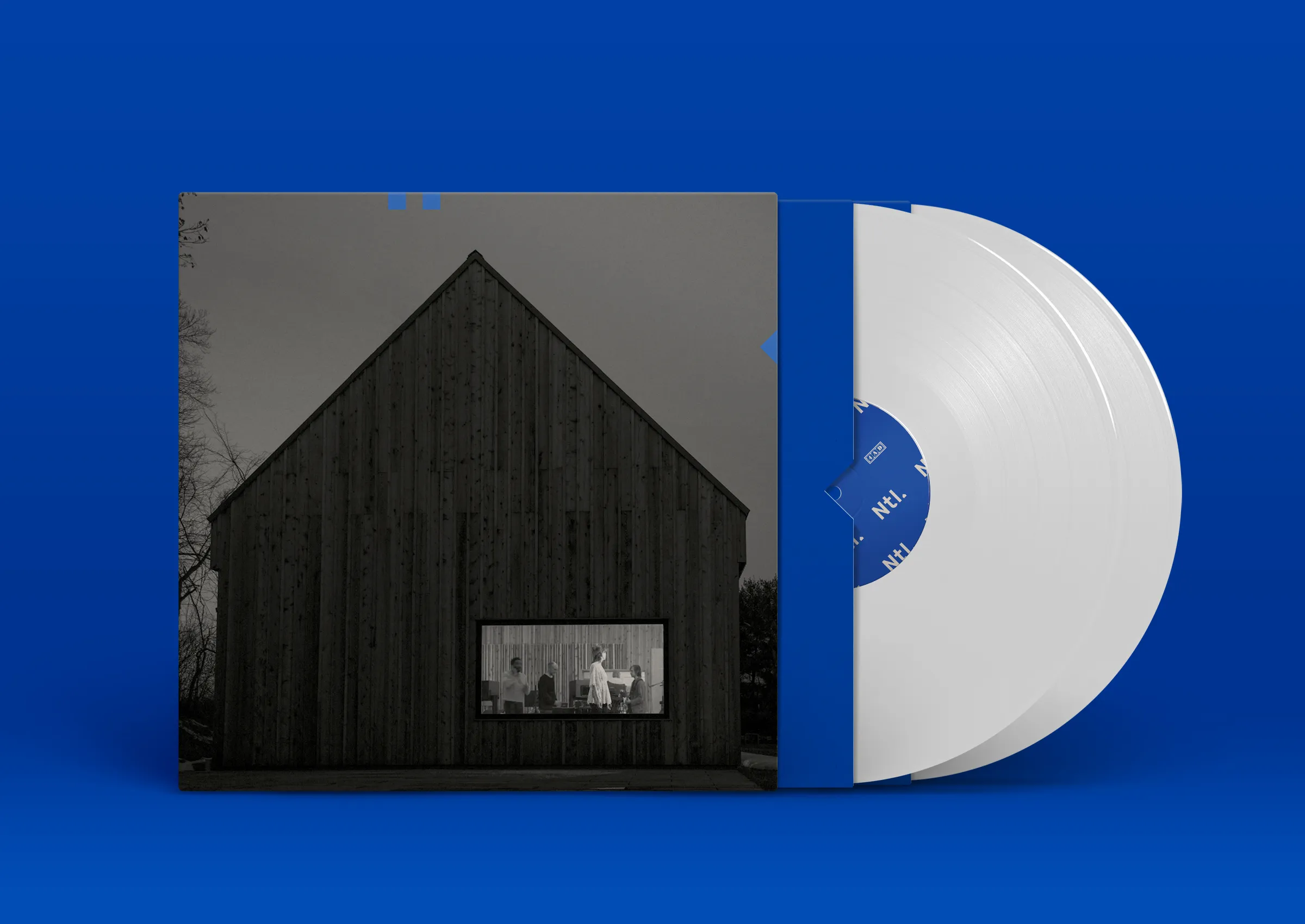
Pentagram/Luke Hayman: Album artwork for The National, Sleep Well Beast

“In theory everyone has the same vote and the same power but there’s things about who’s been there longest, who gets the most press, who brings in certain kinds of projects, who wins the most awards. We each have our values and they’re different. I have seen over eight years discussions where I was definitely on one side and now I see it from another point of view. Maybe we don’t have to take over the world, maybe it’s ok if we lose some projects to Wolff Olins, maybe it’s good that we don’t make as much money because we’ll have more people with suits.”


Luke Hayman interviewed by ‘It’s Nice That’
Pentagram/Micheal Beirut: Brand identity for the Poetry Foundation

“If you were practising on your own, you wouldn’t necessarily be provoking yourself to think in [certain] ways. That cyclical reinvention is happening for each partner. The formula, if there is a formula, is in that regeneration.”

Micheal Beirut interviewed by ‘It’s Nice That’
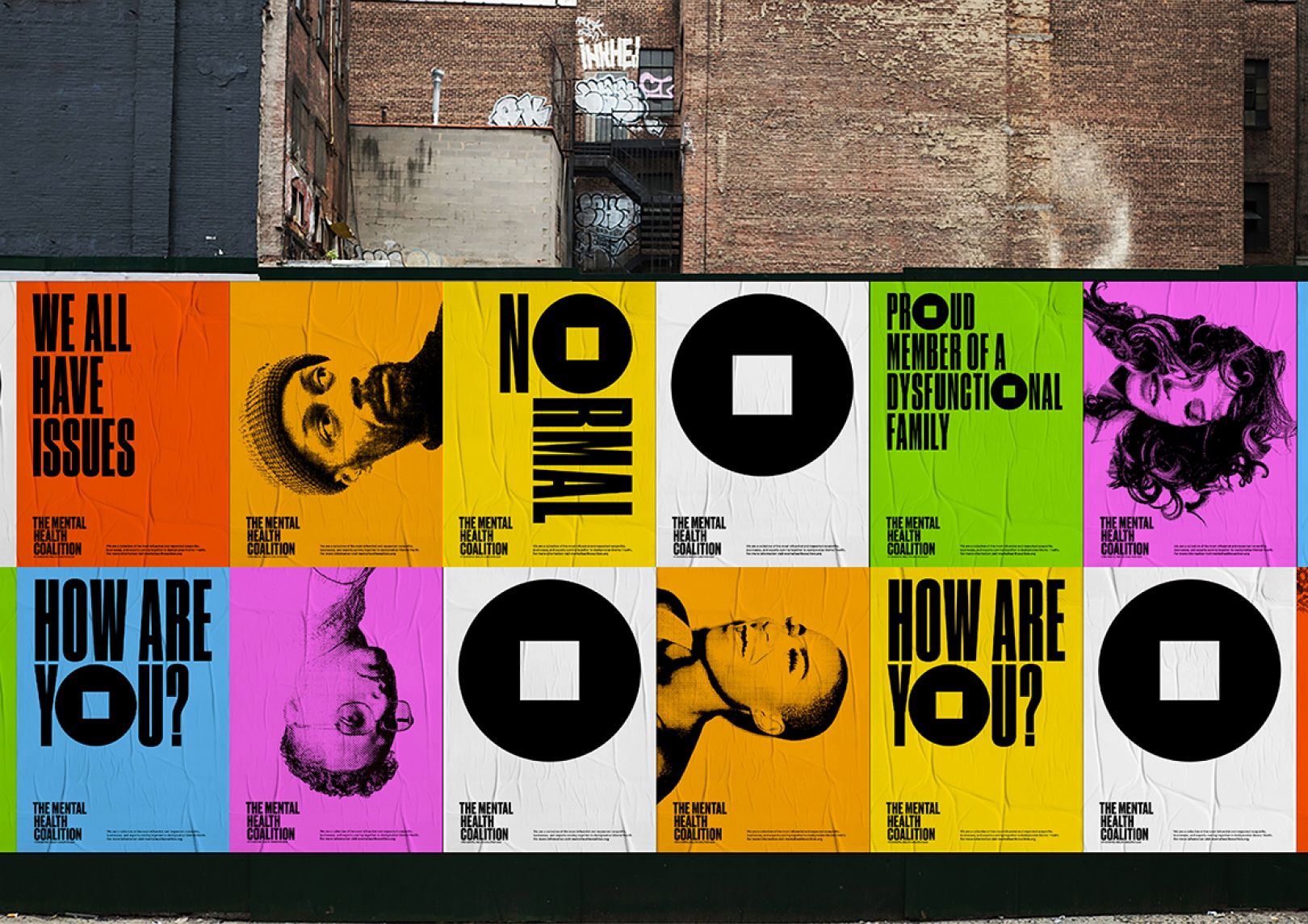
Pentagram/ Paula Scher: Identity for the Mental Health Coalition

“Students of mine who have gone into big agencies, they’re making changes, they’re not making things. Or they’re making things to make the thing. Or they’re being hired to make the presentation to show the company what it might be like if they do get hired to make the thing!”

Paula Scher interviewed by ‘It’s Nice That’
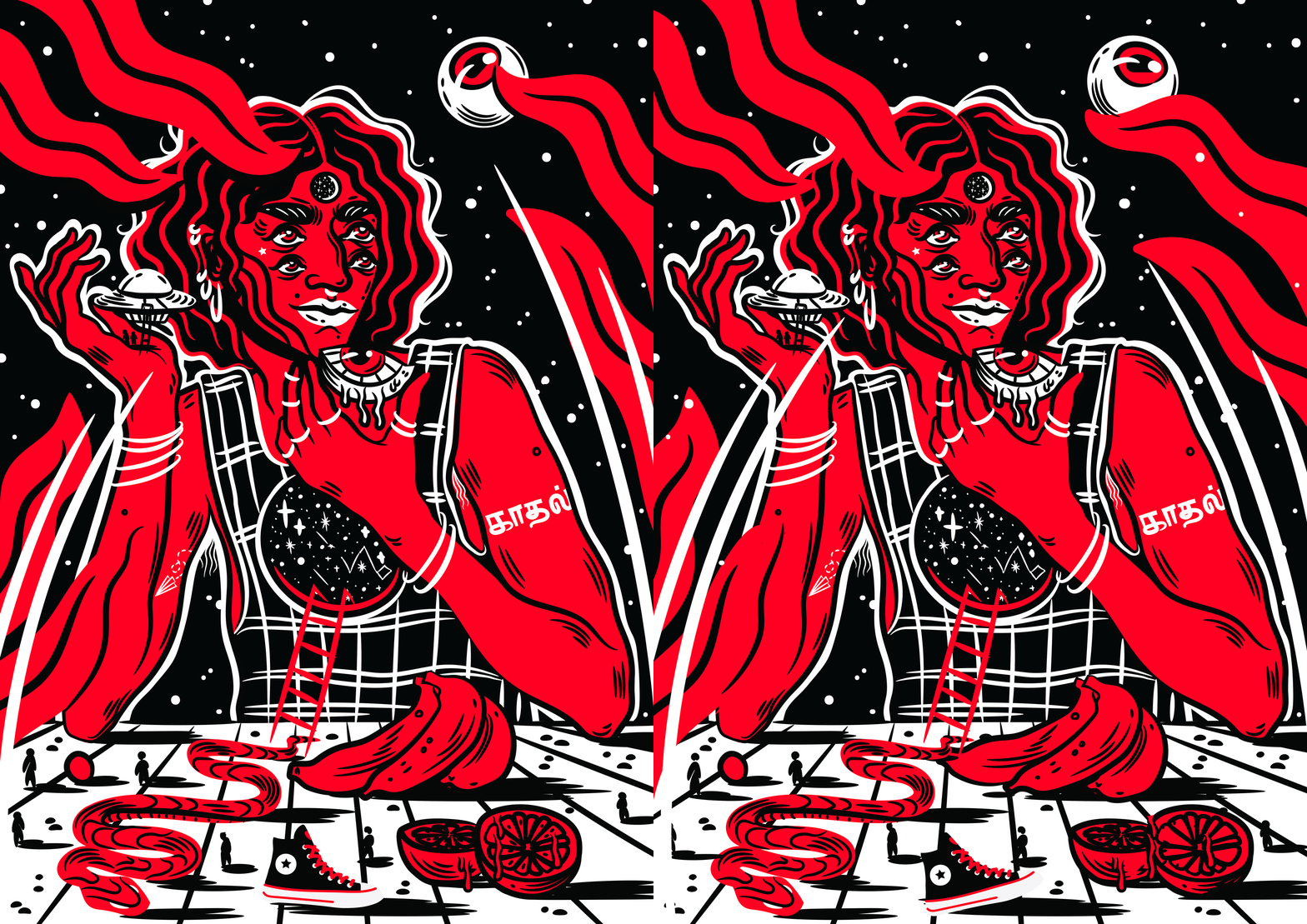
Osheen Siva – Illustration

“Osheen Siva is an illustrator and artist from South India, currently based in Goa. Her works revolve around themes of femininity, sexuality and gender and its intersection with technology and society. Through the lens of surrealism, speculative fiction and science fiction and rooted in mythologies and her dalit and Tamilian heritage, Siva imagines new worlds of decolonized dreamscapes, futuristic oasis with mutants and monsters and narratives of feminine power generally lacking in popular art and culture. 

Past clients have included – Gucci, Vans, Converse, Levis, LennyLetter, Dr.Martens, Verve Magazine, Royal Enfield, Sofar, Medium, Decolonize Fest among others.” –

osheensiva.com/about

I absolutely fell in love with Osheen Sivas work the first time I saw it. I love the way she blends elements of Indian traditional art styles, mythology and Indian commercial work with a more contemporary illustrative style which bares many resemblances to western comic book artwork or even pop art, especially the work of Roy Lichtenstein. Some of her work even has sci-fi or psychedelic quialities to it which is a really interesting fusion and a clever way to explore topics of gender and sexuality.

Her use of line and colour are so clean and blocky that it is, at times, difficult to decipher what has been has been produced digitally and what has been hand painted. Siva does use a mixture of digital illustration and hand painting and has also added subtle animation to her digital work. I really like the way the animations add some emphasis to her drawings without becoming the entire feature.

Grace Before Jones: Camera, Disco, Studio – Exhibition at Nottingham Contemporary

On Saturday I donned my mask and visited Nottingham Contemporary for the first time since before the lockdown. The exhibition left me feeling more inspired than I have done in months. This is probably due to the fact that the pandemic has made any opportunity to leave the house seem so much more meaningful, paired with the fact that I am already in love with Grace Jones, this was the perfect recipe to drag me out of the creative rut I’ve felt stuck in during this crazy time and has reignited a spark of obsession which I haven’t experienced in a long time.

Part of the exhibition which really piqued my interest was the work of photographer and graphic designer, Jean-Paul Goude. Goude & Jones’ were romantic and creative partners between 1977 and 1984. The pair met through the New York disco scene and Goude soon began to take on the production of artwork for Jones’ album covers as well as stage managing her live shows.
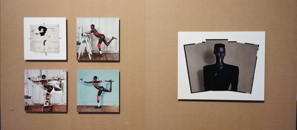
Photograph from Grace Before Jones: Camera, Disco, Studio at Nottingham Contemporary. Left: Island Life album artwork – 1985, right: Nightclubbing album artwork 1981

The exhibition displayed the development behind the iconic Island Life album artwork in which, Grace Jones is presented in an impossible position. Her limbs have been artificially extended by cutting up the original photograph, spreading the pieces and painting over the gaps. Her skin has been darkened and given an unrealistic sheen as if she is made from PVC. The same method is used for the album artwork for Nightclubbing. Here, Grace’s angular features are accentuated, contributing to her androgynous and intimidating aesthetic and persona.

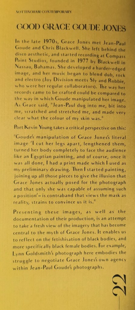
During the time the couple collaborated, Jones’ music began to steer away from disco and instead incorporate the darker sounds of post-punk blended with new wave and dub reggae. Goude’s surreal, distorted, and darkened depictions of Grace reflect this change of direction sonically but also reflect a more sinister side to his work which cannot go unchallenged in the era of the Black Lives Matter movement. I am of course, referring to the fetishization of black and female bodies which underpins so much of Goude’s work. Goude regularly exaggerates features of gender and race through a white male gaze which makes his work as controversial as it is visually stunning. The exhibition catalogue highlights this issue including a quote from Grace Jones herself about her work with Goude. “Jean-Paul dug into me, bit into me, scratched and stretched me, and made very clear what the colour of my skin was.”

Exhibition catalogue for Grace Before Jones: Camera, Disco, Studio at Nottingham Contemporary

2014 – Goude Breaks The Internet

In the age of the social media influencer we are bombarded constantly with images of unrealistically proportioned bodies. This has pushed a standard of beauty which is impossible to achieve without some form of editing, be it digitally editing or surgically editing. The line between real and fake is obscured through our screens.

The phenomenon of blackfishing highlights just how much the black female form specifically has become fetishized in our culture. Black women’s physical features such as skin tones, body shapes, lips, and hairstyles, are being co-opted by non-black people for fashion. This is despite black women still facing discrimination for the very features that have become so fashionable.

One controversial celebrity who has been accused of perpetuating this worrying trend on many occasions is Kim Kardashian. Back in 2014, Jean-Paul Goude photographed Kim Kardashian nude for the winter cover of Paper Magazine. This shoot would be remembered as the post that would #breaktheinternet.

The nude images stirred up a media frenzy and there was much debate over the extent to which the images were photoshopped. There is a clear resemblance in these shots to the shimmering skin and unrealistic proportions and positions Goude created for Grace Jones’ artwork. Goude’s 1976 portrait “Carolina Beaumont” was the direct inspiration for the cover shot of Kim popping a bottle of champagne into a glass balanced on her behind. The photograph was included in Goude’s questionably titled book, “Jungle Fever.” Another clear demonstration of the way Goude perceives the bodies of black women.

In a 2014 article for BBC Trending, African-American writer, and cultural critic, Mikki Kendall states that the popularity of Kardashian’s image shows how “black” body features are often more acceptable on white women. “The Kim Kardashian cover is the latest example of how racial double standards around nudity are enforced, as well as a prime example of how often women who do pose nude for art are attacked while the artists are absolved,”.

Even more worryingly, Goude’s photographs of Kim have been compared by some to Saartjie Baartman, a Khoisan woman who was forced to perform to audiences throughout Europe as the “Hottentot Venus” in the early 19th century on account of her . She is known as worldwide symbol of racism, colonization, and the objectification of the black female body.

Innovations in Typography

Alison Carmichael

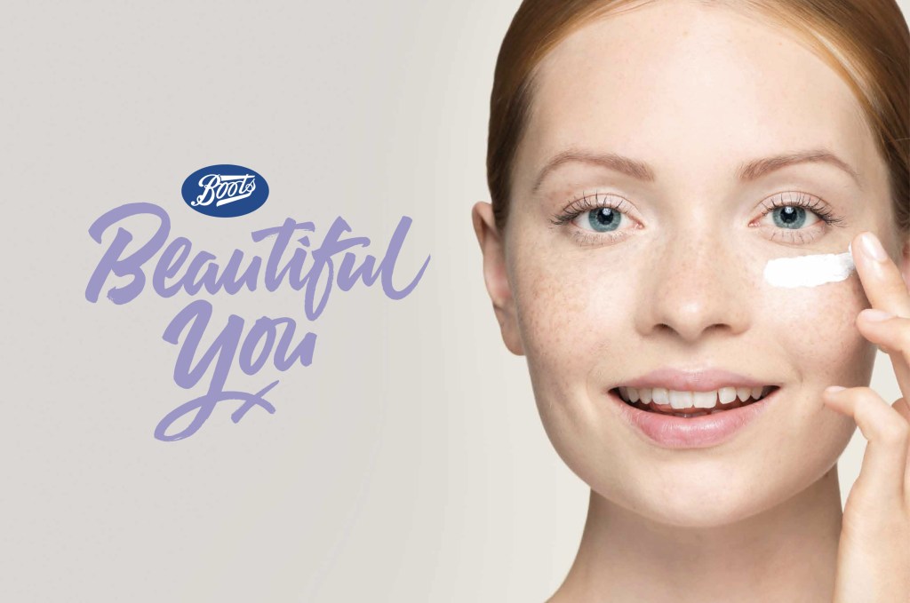
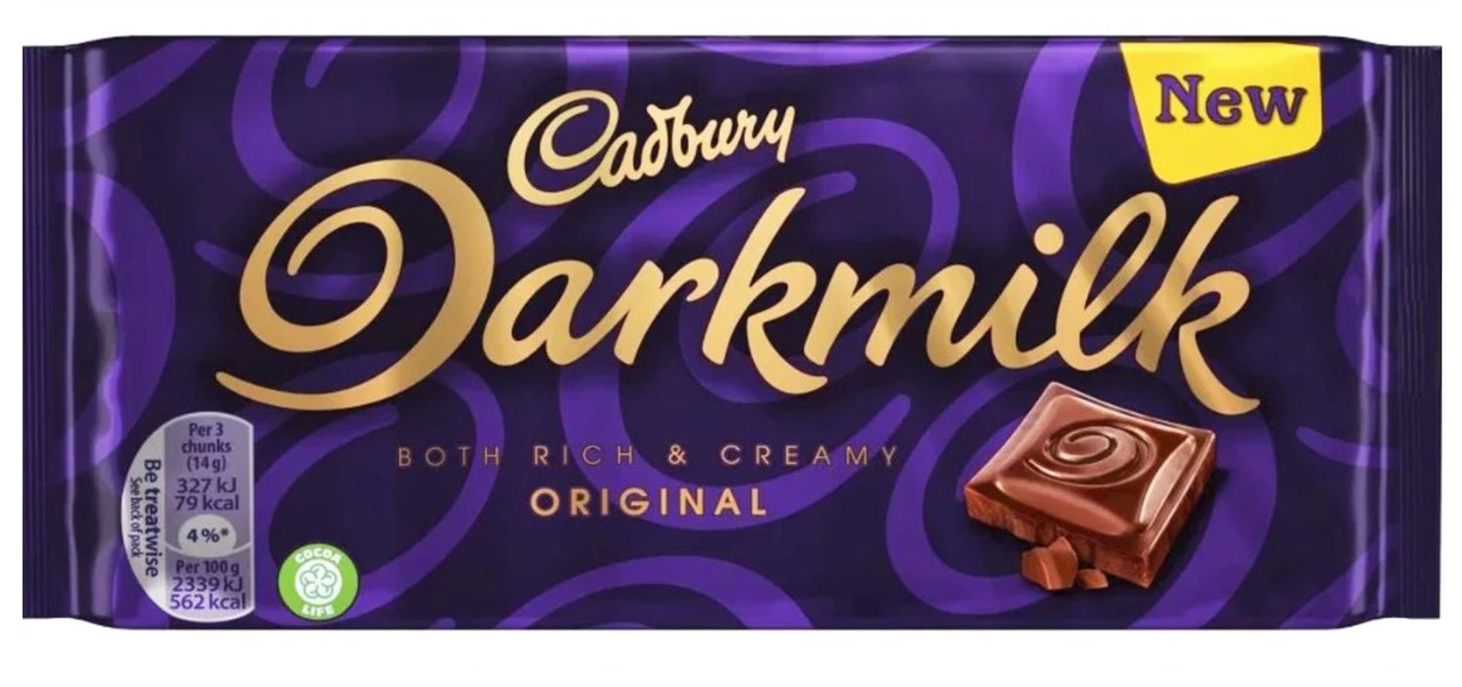
Alison Carmichael has been in the industry for over 20 years. Her distinctive style of hand lettering has been used for some huge brands including KFC, Boots and Cadbury’s to name but a few.

Her style is best known for it’s flowing cursive letterforms which are popular with brands as it gives a more personal feel than something produced digitally. By hand lettering instead of using pre-existing fonts, Carmichael is able to create something bespoke which matches the tone her clients are aiming for. SInce so much of typography today is produced digitally, this makes her work stand out.

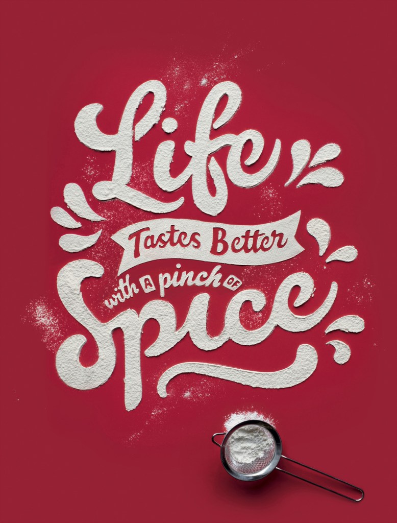
Carmichael’s work goes far beyond standard handlettering practices. She often uses unconventional materials to produce her typography. For example, she used ketchup to produce the cover of Time Out London’s Cheap Eats issue.

It is her signitaure cursive hand lettering but using ketchup as the medium contrasts such a precise and beautiful style. It invites the viewer to smile at the contrast and ask questions. How did she get it so neat?

Carmicheal discusses her process for this piece in an interview with Pen Heaven. She states that ” it’s all about scale!! With something like the ketchup on the cover of time out for the “cheap eats” issue, it appeared that the lettering was about the same size as a normal dinner plate. It was, in fact much bigger than that and resized digitally. I created the artwork in pencil on paper and then enlarged it and printed it out at the size I wanted to create it. Then I used graphite rubdown paper to create a feint outline of the lettering on the surface that it was being photographed on and then carefully filled and built up the shapes of the letters using the wrong end of a teaspoon – So no clever digital trickery there!”.

Further examples of this approch in her work include using flour for KFC and sprinkles in a piece called There’s a Good Girl which was produced for the Viva Women Exhibition put together by Jo Wallace of Saatchi and Saatchi to showcase the work of ground breaking female creatives.

Editorial & Art Direction

David Carson – RayGun

Ray Gun was an alternative rock magazine founded in 1992 by art director David Carson alongside editors Randy Bookasta and Neil Feineman. The publication ran for seven years.

Carson’s signiature style is seen throughout the magazine’s typography, layout and choice of imagary. This consits of a rejection of the conventional grid format and typographic rules. Often lines of text would be spread over two pages, or simply cut off on the edge of the page. Type was blown up to different sizes that did not indicate any conventional sense of hierarchy. Type overlapped in places. At time parts of the magazine were barely legible. This did not bother Carson as he was more concerned about conveying expression. Carson allowed the feeling of each article to dictate the way it looked. He would respond to the music being spoken about or the tone of the article and try to replicate that feeling visually.

Carson speaks about this approach in an interview for designboom where he talks about the cover of their biggest selling issue. The issue’s cover features no cover lines, instead it simply features a photograph of Keith Richards. Carson justifies this in the interview as “the editor had given me a few cover lines including one about keith richards coming clean about sex, drugs, rock and roll etc. I looked at this portrait and realized you really didn’t need to say anything else, the landscape of his face said it all.”

Advertising

Volkswagen Think Small

In 1959 the adverising agency Doyle Dane Bernbach (DDB) were tasked with marketing the Volkwagen Beetle to an American market. The issue they had was pitching a car that was considered small, ugly and inexpensive compared to the large, angular and stylish cars that were being produced in America at the time.

On top of this, the beetle owed it’s origins to the Nazi regime in a time where those connotations were still very fresh in the public’s mind and would have been off putting to many. The car was intended to be for the ordinary working German people. Not a flashy fashion statement as was popular in the USA.

So how did DDB not only manage to sell the beetle to the USA, but also cause a revolution in advertising in the process?

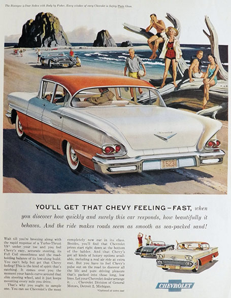
Chevy Biscayne ad, 1958

This Chevrolet ad from 1958 is typical of it’s time. The ad sells the car through it’s Unique Selling Proposition (USP), meaning that it simply highlights all of the benefits of the product that it’s competitors did not have. It also tries to sell the car through selling the lifestyle. The imagary shows young, stylish and attractive individuals enjoying themselves as if to say “This could be you!”. This applied to all manner of advertisments, not just in the automotive industry. As a result, this method of advertising became incredibly repetitive which made the public begin to switch off.

Along came DDB to flip the standard practices used in post-war adverising on their head.

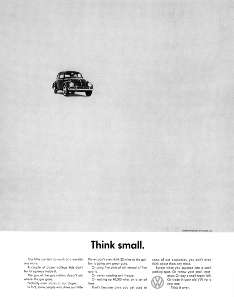
Instead of trying to sell the car as part of the American lifestyle, surrounded by smiling faces in suburbia, or looking out of place next to the typical cars of the era, the beetle is alone in a sea of white space. This would have demanded the attention of the viewer to be focused on the unique design of the car itself. At the time, the monochrome ad would have really stood out in a magazine contrasting the large colourful illustrations people were used to (and becoming bored of) seeing in advertisments.

The minimal design indicated honesty and simplicity. The headline “Think small.” was so understated that it would have been shocking to see in an advertisment at the time. This was also supported by the body text which told the truth about the car. Nothing was exaggerated and it was written with an almost self depreciating tone. The ad makes a statement about how this car was nothing like the desirable cars of the time but in a good way – it was practical and affordable.

Instead of using the full name ‘Volkswagen’, it was shortened to VW to reduce the negative connotations of it being a German car and to make it sound simpler and cooler.

This ad marked a shift in the way both consumers and advertisers thought about advertising. It was a shift towards transparency. Adverts didn’t need to talk down to consumers and simply hammer home the selling points, the tone of voice used became just as important. It was also part of a stylistic shift from the use of illustration to the use of photography in advertisment.

Branding: Logo Design

“A logo derives meaning from the quality of the thing it symbolizes, not the other way around.”

Paul Rand

A logo’s purpose is to be the face of a company. A logo needs to work at both small and large sizes to be fit for whatever purpose the brand may need it for. A logo must have enough longevity to maintain its link to the brand.

Wordmarks

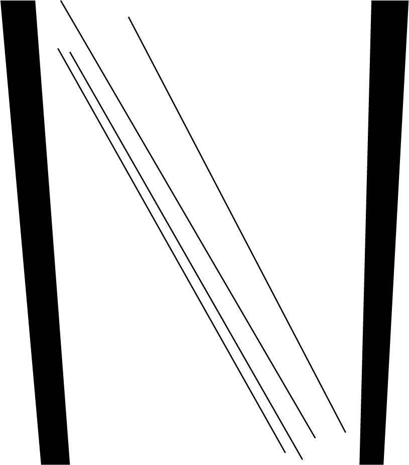
Wordmarks are logos that are typographic. One of the most famous examples of a wordmark logo is Lindon Leader’s logo for FedEx.

Despite being purely typographic, Leader’s arrangement of the letters ‘E’ and ‘X’ create an arrow symbol out of the negative space. In an interview with Creative Bloq, Leader describes the key things the client wanted the identity to communicate as, “precision, service, speed, reliability.” This was achieved through the clean sans serif typeface used to create subliminal messaging in the form of the arrow symbol. The result is a timeless and effective brand identity which still looks up to date over 20 years after it was designed.

Pictoral Logos

Pictoral logos identify the brand using a picture. This can include visual depictions of the brand name or can depict the overall purpose or message of the brand.

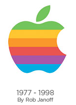
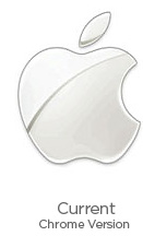
One example of a brand’s name being depicted through a logo is the Apple logo. Throughout years of carving out such a globally recocnised brand identity, the apple logo is easily identified without giving away any visual cues to what the brand produces and no need for type to clarify their name.

The logo that is so recognised today first took shape in 1977 when Rob Janoff was approached by Steve Jobs while the company was less than a year old. Janoff was tasked with developing an identity to coincide with the introduction of the brand’s first personal computer, the Apple II.

The logo was based on a cross section of an apple with a bite taken out of it to provide a sense of scale to avoid it being confused for a different fruit. The rainbow stripes were originally added to represent the Apple II’s ability to display in colour however they were kept right up until 1998. This version of the Apple logo was featured on every Apple product, advertisment, software label and anything else produced by Apple during this time. Since then, the only changes that have been made to the logo are the colours, with it’s overall silhouette remaining the same.

Abstract Iconography

The Logo System

A logo system can use elements of wordmarks, pictoral logos and abstract iconography. The difference is that a logo system is more of a loose framework which needs to still be recognisable but can be flexible to suit a more specific meaning or message for the brand. The logo system is more recent development in logo design brought about by advancements in technology. These days, you’d more likely see a logo on a screen than on a physical object and by having a flexible framework for a logo, brands are given the capability to start conversations with their customers.

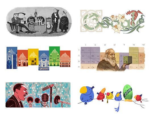
An example of a logo system is the ‘Google doodle.’

The ‘Google Doodle’ raises awareness about historical, cultural or otherwise important events through different illustrations, animations or interactive games in place of their ususal logo. Even though the styles of these doodles varies greatly, they are still recognisable as the google logo. This is partially because of the context of the doodle’s location on the Google homepage but also because of the framework used to maintain the familiar shapes and/or colours of the original logo.

‘Drawing Machine’

Aim

‘Through the use of format, document a variety of sketchbook techniques that show drawing, mark making and observation. Where appropriate apply to project development.’

When I first read the task, I thought back to this video I had stumbled across on YouTube about creating patterns with pendulums.

I decided to try and recreate something similar for my drawing machine. I wasn’t too fussed about being exact and scientific with this since the aim was only to produce marks and I was working with limited room.

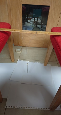
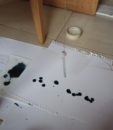
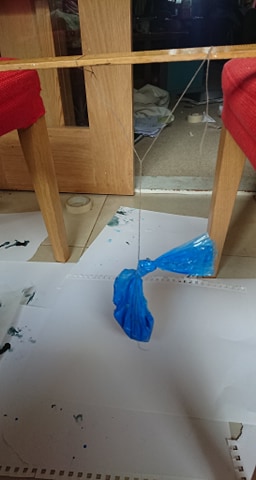
The set-up I used was a meter stick laid across two chairs with an empty biro barrel dangling off it.

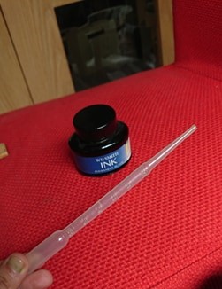
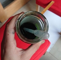
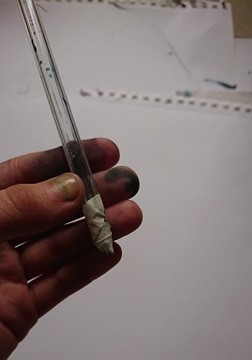
To begin with, I tried using a pipette to pour ink into the pen…

The ink didn’t drip out of the pen slowly like I’d hoped… It got all over my hands too 😦

To try and fix this, I added water to the ink and made the hole at the end of the pen more narrow by taping it up.

This at least resulted in more drips than before.

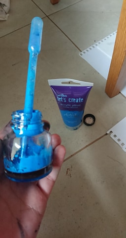
Next I decided to try the same method but with acrylic paint

The acrylic was way too thick! It just stuck to the inside of the pen and only released one drop.

I added water to the paint and found I got more consistent drips.

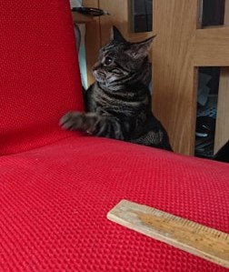
Then an intruder came along to get in the way of my experiments..

After that, I changed my set-up to include a plastic bag filled with watered down acrylic paint in place of the empty biro.

I cut a tiny hole in the corner that faced the paper in the hope it would work like a piping bag for icing.

Yet again I got drips but this time there were enough drips to join together to create different shapes and areas where the paint was thicker or more watered down.

My last attempt at the drawing machine followed the exact same process but I had cut a bigger hole to try to allow for more of a flow of paint instead of drips.

Instead of drips, this time the paint did flow out into swirling patterns.

I’m so glad I captured the effect on video before the page (as well as myself, the floor, my mum’s whole kitchen) was covered in blue acrylic.

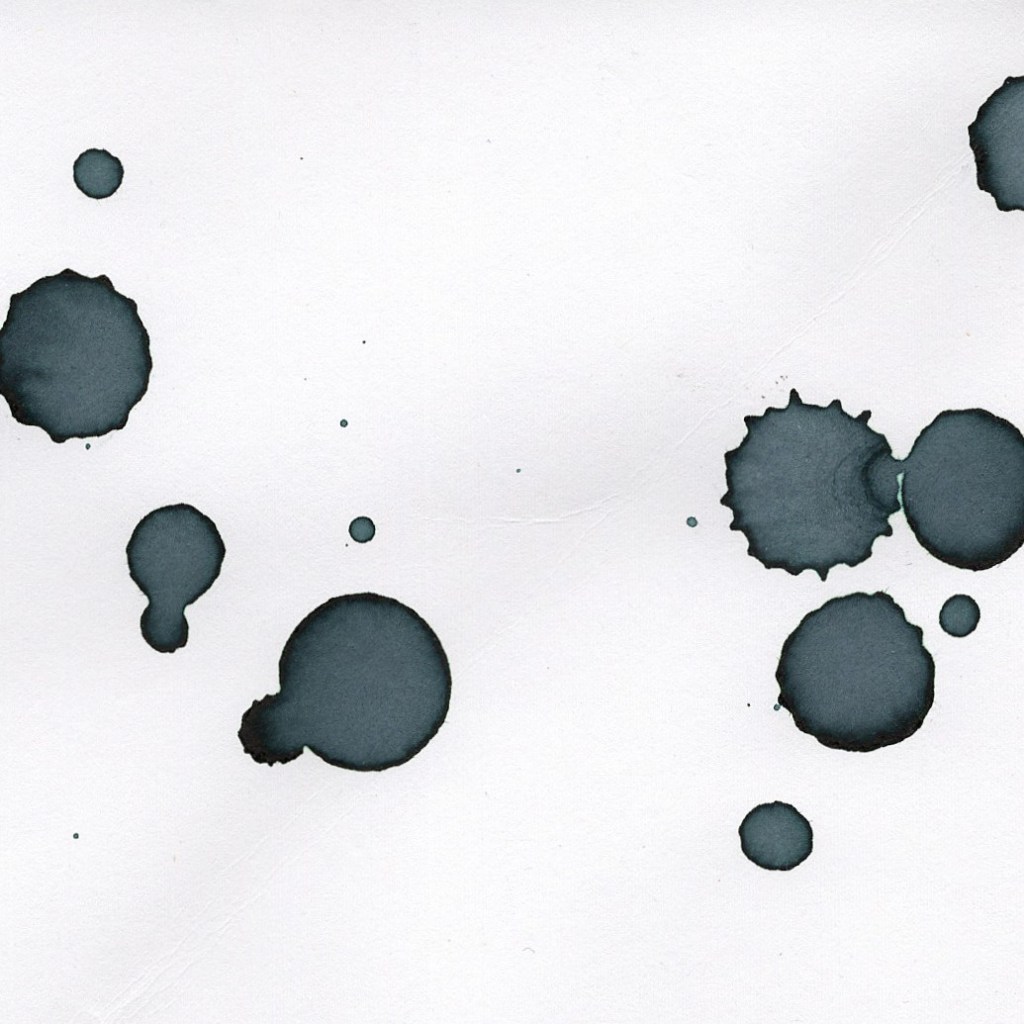
Water & ink through empty biro

The drops from the water and ink ended up having some nice depth to them. I really like effect of the dark ring around the edge of each drop. It’s interesting that some drops have jagged edges while others are much rounder. The jagged edged drips seem to convey a harsher impact than the smooth ones. The most jagged edged drops also remind me of the soot sprites from Spirited Away.

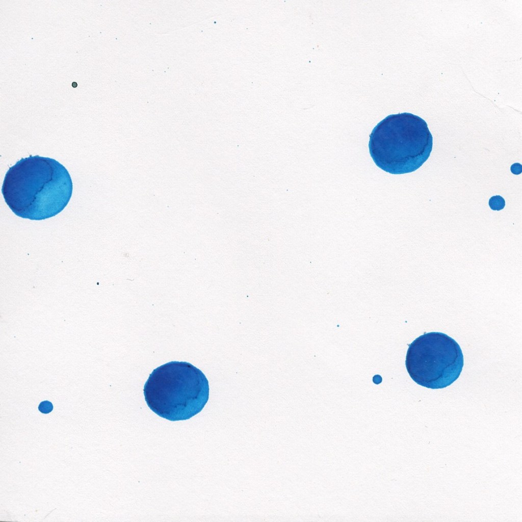
Acrylic & water through empty biro

These drops were much further dispersed and much more uniform in shape than the ink drops. I like the way the paint has dried thicker on one side of each individual drop. It gives each drop a 3D effect as if it is spherical.

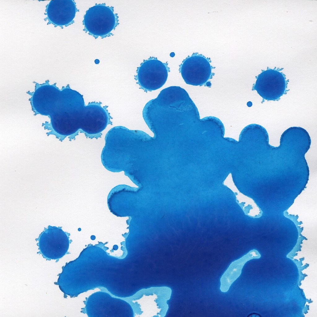
Acrylic & water through plastic bag

I love the range of shades this attempt produced. There is a nice gradient caused where a higher concentration of the paint has run down. The edges have bled in a paler shade of blue which gives a glowing effect.

Alfonse Mucha

I was really inspired by the compositions of Mucha’s work, especially the use of more abstract shapes in the background contrasting with a detailed figure placed centrally. The circle placed behind the head of the figure reminds me of a halo. I also noticed an interesting use of negative space in this piece where the dress seems to fall into one of the shapes below. This is a feature that could be applied to my own work.

I could also take inspiration from the Art Nouveau typography used by either creating my own or sourcing an Art Nouveau font online.

Afonse Mucha, Moët & Chandon Crémant Impérial, 1899, lithograph